Video Player
Overview
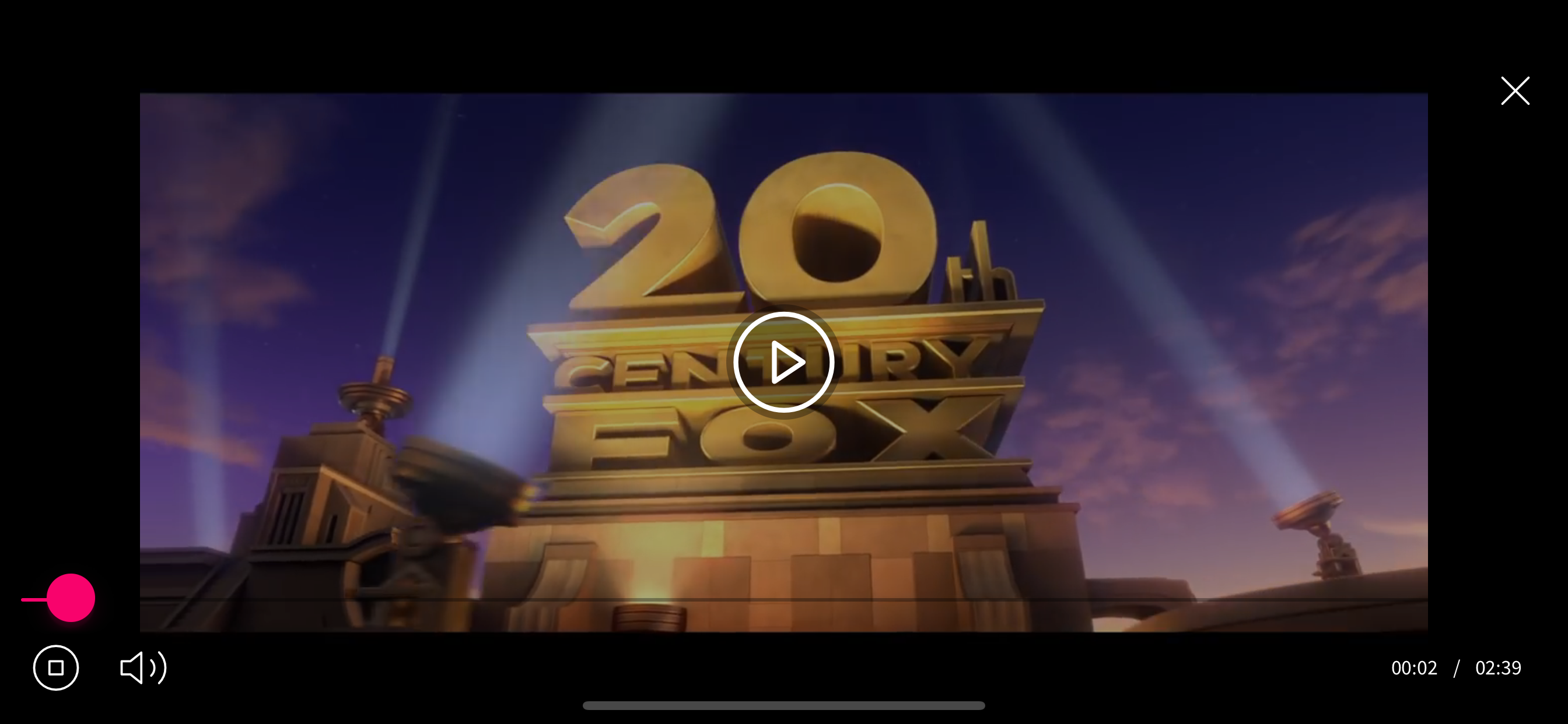
Grial provides a cross-platform video player available in .NET MAUI and Xamarin.Forms that is fully skin-able through XAML templates.
You can use it to put a video as a page background in auto-repeat mode, or as a regular player. It supports fullscreen mode, includes error handling, different aspect modes, and you can opt between the native platform controls or use your own Xaml skin to have a customized cross-platform style.
It can reproduce local and remote mp4, and also videos from YouTube using their web player.

VideoPlayer Properties
| Name | Type | Description |
|---|---|---|
| Aspect | Aspect | Video aspect (AspectFit, AspectFill and Fill) |
| AutoPlay | bool | Automatically play video after loading |
| Duration | TimeSpan | (readonly) Duration of the loaded video |
| ErrorTemplate | ControlTemplate | A template to show when there is an error. Te target type is UXDivers.Grial.VideoPlayerErrorSkin, see below |
| IsLoading | bool | (readonly)Indicates if the video is loading |
| IsMuted | bool | Indicates if the video is muted |
| LoadingSpinnerColor | Color | Loading spinner color, used in the default loading template and can be used from a custom loading template when defined |
| LoadingTemplate | ControlTemplate | A template to show when the video is loading. Te target type is UXDivers.Grial.VideoPlayerLoadingSkin, see below |
| Position | TimeSpan | Get or sets the position of the video |
| Repeat | bool | Indicates if the video will repeat when reaching the end |
| SkinAutohideMillisecondsDelay | int | The skin auto-hides by default in 4 seconds when the video is playing. This property allows tweaking that |
| SkinTemplate | ControlTemplate | A template to show the video controls (play, pause, stop, duration, slider, etc) after the video is loading. Te target type is UXDivers.Grial.VideoPlayerSkin |
| Source | string | Url (online mp4 videos and YouTube links) or local mp4 files (filename and extension) |
| Thumbnail | ImageSource | Preview image to show before the video starts playing, used in the default thumbnail template and can be used from a custom thumbnail template |
| ThumbnailTemplate | ControlTemplate | A template to show before the video starts playing. Te target type is UXDivers.Grial.VideoPlayerThumbnailSkin |
| UseNativeControls | bool | Use platform controls (Android and iOS) instead of a player custom skin |
| AlwaysUseYoutubeWebPlayer | bool | True indicates using Youtube's web player (works on Youtube videos only, of course) |
VideoPlayer Events
| Name | Type | Description |
|---|---|---|
| Ended | Event | Fired when a the video reach the end. |
| Error | Event | Fired when there is an error while loading the video. Args: VideoPlayerErrorEventArgs { Error: string, Exception: Exception } |
VideoPlayer Methods
| Name | Description |
|---|---|
| Pause | Pause the video |
| Play | Play the video |
| HideSkin | Hides the player skin |
| ShowSkin | Show the player skin |
| Stop | Stop the video |
| ToggleFullScreen | Swaps between full screen and inline playing |
Skins
The video player supports 4 different ControlTemplates:
LoadingTemplateErrorTemplateThumbnailTemplateSkinTemplate
Each of these targets a specific skin control type defined just to expose properties and commands to be consumed from these templates. Let's see the API of each skin control type.
LoadingTemplate
The skin control is VideoPlayerLoadingSkin. The default template uses an activity indicator.
| Name | Type | Description |
|---|---|---|
| SpinnerColor | Color | (readonly) Control to be used in the spinner, comes from the LoadingSpinnerColor property of the video player. |
ErrorTemplate
The skin control is VideoPlayerErrorSkin. The default template uses a label to show the error message.
| Name | Type | Description |
|---|---|---|
| Message | string | (readonly) Error message |
| RetryCommand | ICommand | A command that can be used to retry |
ThumbnailTemplate
The skin control is VideoPlayerThumbnailSkin. The default template uses an image to show the thumbnail.
| Name | Type | Description |
|---|---|---|
| Thumbnail | ImageSource | (readonly) The image to display as thumbnail, comes from the Thumbnail property of the video player |
| PlayCommand | ICommand | A command that can be used to start the video |
SkinTemplate
The skin control is VideoPlayerSkin. This is the most complex skin control because it needs to support all the interactions needed for a loaded video player.
| Name | Type | Description |
|---|---|---|
| Position | TimeSpan | (readonly) The current position |
| Duration | TimeSpan | (readonly) The video duration |
| IsFullScreen | bool | (readonly) Indicates if the video is in fullscreen mode or not |
| IsPlaying | bool | (readonly) Indicates if the video is playing or not |
| IsMuted | bool | (readonly) Indicates if the video is muted or not |
| Repeat | bool | (readonly) Indicates if the video should restart when reaching the end |
| VideoProgress | double | A value between 0 and 1 designed for two-way bindings to control the position in the video |
| PlayCommand | ICommand | The command to play the video |
| PauseCommand | ICommand | The command to pause the video |
| StopCommand | ICommand | The command to stop the video |
| ToggleFullScreenCommand | ICommand | The command to toggle the fullscreen mode (see below for more information about this mode) |
| ToggleMuteCommand | ICommand | The command to mute/unmute |
| ToggleRepeat | ICommand | The command to toggle the repeat mode |
As an example, a super simple template with just a play/pause button would look like this:
<ControlTemplate x:Key="VideoPlayerSkin">
    <Grid>
        <!--PLAY BUTTON-->
        <Button
            IsVisible="{ TemplateBinding IsPlaying, Converter={ StaticResource NegateBooleanConverter } }"
            Text="PLAY"
            Command="{ TemplateBinding PlayCommand }"
        />

        <!--PAUSE BUTTON-->
        <Button
            IsVisible="{ TemplateBinding IsPlaying }"
            Text="PAUSE"
            Command="{ TemplateBinding PauseCommand }"
        />
    </Grid>
</ControlTemplate>
Grial comes with a full template for this. See below.
Fullscreen
The video player supports toggling between inline and full screen modes. To enable that you just need to wrap it inside a VideoPlayerContainer:
<grial:VideoPlayerContainer>
    <grial:VideoPlayer
        Source="local_video.mp4"
    />
</grial:VideoPlayerContainer>
After that, the ToggleFullScreenCommand from the VideoPlayerSkin (see above) can be used to swap between modes.
Grial also includes a helper behavior called FullScreenVideoBehavior that can be used to open a video in full screen mode when clicking a button like this:
<Button Text="Play video">
    <Button.Behaviors>
        <grial:FullScreenVideoBehavior
            Source="local_video.mp4"
            SkinTemplate="{ StaticResource VideoPlayerSkin }"
        />
        </Button.Behaviors>
</Button>
Look and Feel
The Grial video player look and feel can be modified through the following file:
Grial
    |_ Styles
        |_ VideoPlayer
            |_ VideoPlayerResources.xaml
It contains all resources in charge of setting the appearance of the video player skin such as icons, colors, sizes, etc., but the most important is the "VideoPlayerSkin" ControlTemplate which is the default look and feel of the Grial video player.
There's one important named style for the video player named "BackgroundVideoPlayerStyle" which is helpful for using videos as background.