Stepper
Overview
Grial's Stepper allows displaying a set of elements that represents steps and the progress associated.
Getting Started
To start working with the Stepper you have to specify three templates:
ActiveItemTemplate: sets the looks of the step when progress is greater the index of this step.CurrentItemTemplate: sets the looks of the step when the index of the step matches the progress.InactiveItemTemplate: sets the looks of the step when the index of the step is greater than the progress.
Or you can use ItemTemplate property to apply the template to all states.
If you want the stepper to place the progress bar based on a VisualElement you should set PART_ProgressSizeReference name to a VisualElement in all of the templates for the different states otherwise the stepper will use the template itself as the reference. If it's not the case you can use ProgressBarVerticalOptions, ProgressBarHorizontalOptions and ProgressBarMargin to place the progress bar at the desired location. Using a VisualElement for reference also will set up spacing between items automatically if its not provided. If ProgressBarMargin is set the reference size is not used.
The size of the items can be specified through ItemSize property or the Stepper will use the size of the named visual element or the template itself.
Apart from that the ItemsSource property must be set with the steps you want to display.
Animations to current step changes are enabled by default, it has a built in animation that will animate the change using clipping. You can provide a BaseAnimation to the ArriveAnimation property to use on of the provided by us like the FadeToAnimation or a AnimationStoryboard, or you can create a custom one.
Samples
Basic Stepper

Xaml
...
<ResourceDictionary>
    <!-- BASIC STEP ICON BASE STYLE -->
    <Style x:Key="BasicStepItemIconStyle" TargetType="Label">
        <Setter Property="FontSize" Value="24" />
        <Setter Property="VerticalTextAlignment" Value="Center" />
        <Setter Property="HorizontalTextAlignment" Value="Center" />
        <Setter Property="FontFamily" Value="GrialIconsFill" />
    </Style>

    <!-- BASIC STEP TITLE BASE STYLE -->
    <Style x:Key="BasicStepItemTitleStyle" TargetType="Label">
        <Setter Property="FontSize" Value="10" />
        <Setter Property="Text" Value="{Binding Label}" />
        <Setter Property="VerticalTextAlignment" Value="Center" />
        <Setter Property="HorizontalTextAlignment" Value="Center" />
        <Setter Property="Grid.Row" Value="1" />
    </Style>

    <!-- BASIC STEP BORDER BASE STYLE -->
    <Style x:Key="BasicStepItemBorderStyle" TargetType="Border">
        <Setter Property="Padding" Value="14" />
        <Setter Property="VerticalOptions" Value="Center" />
        <Setter Property="HorizontalOptions" Value="Center" />
        <Setter Property="StrokeThickness" Value="2" />
        <Setter Property="StrokeShape" Value="RoundRectangle 40,40,40,40" />
    </Style>

    <!-- ACTIVE BASIC STEP STYLE -->
    <DataTemplate
        x:Key="BasicActiveItemTemplate"
        x:DataType="local:Step"
        >
        <Grid
            RowDefinitions="*,Auto"
            RowSpacing="4"
            >
            <!-- ICON BORDER -->
            <Border
                x:Name="PART_ProgressSizeReference"
                Style="{StaticResource BasicStepItemBorderStyle}"
                BackgroundColor="#3F75FF"
                Stroke="#3F75FF"
                >
                <!-- ICON -->
                <Label
                    Style="{StaticResource BasicStepItemIconStyle}"
                    Text="{Binding Icon}"
                    TextColor="White"
                    />
            </Border>
            <!-- TITLE -->
            <Label
                Grid.Row="1"
                Style="{StaticResource BasicStepItemTitleStyle}"
                TextColor="#3F75FF"
                />
        </Grid>
    </DataTemplate>

    <!-- CURRENT BASIC STEP STYLE -->
    <DataTemplate
        x:Key="BasicCurrentItemTemplate"
        x:DataType="local:Step"
        >
        <Grid
            RowDefinitions="*,Auto"
            RowSpacing="4"
            >

            <!-- ICON BORDER -->
            <Border
                x:Name="PART_ProgressSizeReference"
                Style="{StaticResource BasicStepItemBorderStyle}"
                BackgroundColor="White"
                Stroke="#3F75FF"
                >
                <!-- ICON -->
                <Label
                    Style="{StaticResource BasicStepItemIconStyle}"
                    Text="{Binding Icon}"
                    TextColor="#3F75FF"
                    />
            </Border>
            <!-- TITLE -->
            <Label
                Grid.Row="1"
                Style="{StaticResource BasicStepItemTitleStyle}"
                TextColor="#3F75FF"
                />
        </Grid>
    </DataTemplate>

    <!-- INACTIVE BASIC STEP STYLE -->
    <DataTemplate
        x:Key="BasicInactiveItemTemplate"
        x:DataType="local:Step"
        >
        <Grid
            RowDefinitions="*,Auto"
            RowSpacing="4"
            >
            <!-- ICON BORDER -->
            <Border
                x:Name="PART_ProgressSizeReference"
                Style="{StaticResource BasicStepItemBorderStyle}"
                BackgroundColor="#DBE0ED"
                Stroke="#DBE0ED"
                >
                <!-- ICON -->
                <Label
                    Style="{StaticResource BasicStepItemIconStyle}"
                    Text="{Binding Icon}"
                    TextColor="#BBBBBB"
                    />
            </Border>
            <!-- TITLE -->
            <Label
                Grid.Row="1"
                Style="{StaticResource BasicStepItemTitleStyle}"
                TextColor="#A2AECC"
                />
        </Grid>
    </DataTemplate>
<ResourceDictionary>
...
<!-- BASIC STEPPER -->
<grial:Stepper
    ItemsSource="{Binding BasicStepperViewModel.Steps}"
    IsProgressBarContinuous="True"
    StrokeSize="4"
    Progress="1"
    AnimateProgressDuration="500"
    AnimateProgress="True"
    HeightRequest="70"
    ActiveColor="#3F75FF"
    InactiveColor="#D9E3FF"
    ActiveItemTemplate="{StaticResource BasicActiveItemTemplate}"
    CurrentItemTemplate="{StaticResource BasicCurrentItemTemplate}"
    InactiveItemTemplate="{StaticResource BasicInactiveItemTemplate}"
    />
...
CSharp
public class BasicStepperViewModel : ObservableObject
{
    public ObservableCollection<Step> Steps { get; } = [
		new Step { Label = "Profile", Icon = GrialIconsFont.User },
		new Step { Label = "Shipping", Icon = GrialIconsFont.Box },
		new Step { Label = "Rating", Icon = GrialIconsFont.Star },
	];
}

public class Step : ObservableObject
{
	private string _label;
	private string _description;

	public string Label
	{
		get => _label;
		set => SetProperty(ref _label, value);
	}

	public string Icon
	{
		get => _description;
		set => SetProperty(ref _description, value);
	}
}
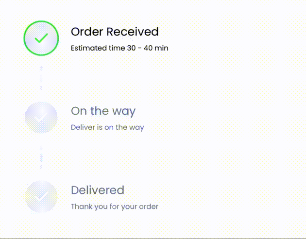
Vertical Stepper
Xaml
...
<ResourceDictionary>
    <!-- VERTICAL STEP ICON BASE STYLE -->
    <Style x:Key="VerticalStepItemIconStyle" TargetType="Label">
        <Setter Property="FontSize" Value="24" />
        <Setter Property="VerticalTextAlignment" Value="Center" />
        <Setter Property="HorizontalTextAlignment" Value="Center" />
        <Setter Property="FontFamily" Value="GrialIconsFill" />
        <Setter Property="Text" Value="{x:Static local:GrialIconsFont.Check}" />
    </Style>

    <!-- VERTICAL STEP TITLE BASE STYLE -->
    <Style x:Key="VerticalStepItemTitleStyle" TargetType="Label">
        <Setter Property="FontSize" Value="16" />
        <Setter Property="Text" Value="{Binding Label}" />
    </Style>

    <!-- VERTICAL STEP DESCRIPTION BASE STYLE -->
    <Style x:Key="VerticalStepItemDescriptionStyle" TargetType="Label">
        <Setter Property="FontSize" Value="10" />
        <Setter Property="Text" Value="{Binding Description}" />
    </Style>

    <!-- VERTICAL STEP BORDER BASE STYLE -->
    <Style x:Key="VerticalStepItemBorderStyle" TargetType="Border">
        <Setter Property="HeightRequest" Value="50" />
        <Setter Property="StrokeThickness" Value="2" />
        <Setter Property="StrokeShape" Value="RoundRectangle 40,40,40,40" />
    </Style>

    <!-- ACTIVE VERTICAL STEP STYLE -->
    <DataTemplate
        x:Key="VerticalActiveItemTemplate"
        x:DataType="local:Step"
        >
        <Grid
            ColumnDefinitions="50,*"
            Padding="5"
            ColumnSpacing="16"
            >
            <!-- ICON BORDER -->
            <Border
                x:Name="PART_ProgressSizeReference"
                Style="{StaticResource VerticalStepItemBorderStyle}"
                BackgroundColor="#34EB3D"
                Stroke="#34EB3D"
                >
                <!-- ICON -->
                <Label
                    Style="{StaticResource VerticalStepItemIconStyle}"
                    TextColor="White"
                    />
            </Border>
            <VerticalStackLayout
                Grid.Column="1"
                VerticalOptions="Center"
                Spacing="4"
                >
                <!-- TITLE -->
                <Label
                    Style="{StaticResource VerticalStepItemTitleStyle}"
                    TextColor="Black"
                    />
                <Label
                    Style="{StaticResource VerticalStepItemDescriptionStyle}"
                    TextColor="Black"
                    />
            </VerticalStackLayout>
        </Grid>
    </DataTemplate>

    <!-- CURRENT VERTICAL STEP STYLE -->
    <DataTemplate
        x:Key="VerticalCurrentItemTemplate"
        x:DataType="local:Step"
        >
        <Grid
            ColumnDefinitions="50,*"
            Padding="5"
            ColumnSpacing="16"
            >
            <!-- ICON BORDER -->
            <Border
                x:Name="PART_ProgressSizeReference"
                Style="{StaticResource VerticalStepItemBorderStyle}"
                BackgroundColor="#F1F3F8"
                Stroke="#34EB3D"
                >
                <!-- ICON -->
                <Label
                    Style="{StaticResource VerticalStepItemIconStyle}"
                    TextColor="#34EB3D"
                    />
            </Border>
            <VerticalStackLayout
                Grid.Column="1"
                VerticalOptions="Center"
                Spacing="4"
                >
                <!-- TITLE -->
                <Label
                    Style="{StaticResource VerticalStepItemTitleStyle}"
                    TextColor="Black"
                    />
                <Label
                    Style="{StaticResource VerticalStepItemDescriptionStyle}"
                    TextColor="Black"
                    />
            </VerticalStackLayout>
        </Grid>
    </DataTemplate>

    <!-- INACTIVE VERTICAL STEP STYLE -->
    <DataTemplate
        x:Key="VerticalInactiveItemTemplate"
        x:DataType="local:Step"
        >
        <Grid
            ColumnDefinitions="50,*"
            Padding="5"
            ColumnSpacing="16"
            >
            <!-- ICON BORDER -->
            <Border
                x:Name="PART_ProgressSizeReference"
                Style="{StaticResource VerticalStepItemBorderStyle}"
                BackgroundColor="#F1F3F8"
                Stroke="White"
                >
                <!-- ICON -->
                <Label
                    Style="{StaticResource VerticalStepItemIconStyle}"
                    TextColor="White"
                    />
            </Border>
            <VerticalStackLayout
                Grid.Column="1"
                VerticalOptions="Center"
                Spacing="4"
                >
                <!-- TITLE -->
                <Label
                    Style="{StaticResource VerticalStepItemTitleStyle}"
                    TextColor="#6F7A8F"
                    />
                <Label
                    Style="{StaticResource VerticalStepItemDescriptionStyle}"
                    TextColor="#6F7A8F"
                    />
            </VerticalStackLayout>
        </Grid>
    </DataTemplate>
</ResourceDictionary>
...
<!-- VERTICAL STEPPER -->
<grial:Stepper
    ItemsSource="{Binding VerticalStepperViewModel.Steps}"
    IsProgressBarContinuous="False"
    StrokeSize="4"
    Progress="1"
    AnimateProgress="False"
    HeightRequest="300"
    ProgressBarDashPattern="2,2"
    IsHorizontal="False"
    ItemSize="80"
    ActiveColor="Transparent"
    InactiveColor="#F1F3F8"
    ActiveItemTemplate="{StaticResource VerticalActiveItemTemplate}"
    CurrentItemTemplate="{StaticResource VerticalCurrentItemTemplate}"
    InactiveItemTemplate="{StaticResource VerticalInactiveItemTemplate}"
    />
...
CSharp
public class VerticalStepperViewModel : ObservableObject
{
	public ObservableCollection<Step> Steps { get; } = [
		new Step { Label = "Order Received", Icon = GrialIconsFont.Check, Description="Estimated time 30 - 40 min" },
		new Step { Label = "On the way", Icon = GrialIconsFont.Check, Description="Deliver is on the way" },
		new Step { Label = "Delivered", Icon = GrialIconsFont.Check, Description="Thank you for your order" },
	];
}

public class Step : ObservableObject
{
	private string _label;
	private string _description;

	public string Label
	{
		get => _label;
		set => SetProperty(ref _label, value);
	}

	public string Icon
	{
		get => _description;
		set => SetProperty(ref _description, value);
	}

	public string Description
	{
		get => _description;
		set => SetProperty(ref _description, value);
	}
}
Control API
Properties
| Name | Type | Description |
|---|---|---|
| ActiveColor | Color | Gets or sets the for the active part representing the Progress in the progress bar behind steps. |
| ActiveItemTemplate | DataTemplate | Gets or sets the template for items before CurrentItem. |
| AnimateArrival | bool | Gets or sets if current step change is animated. |
| AnimatedProgress | double | Gets the animated changes of the Progress value. |
| AnimateProgress | bool | Gets or sets if Progress is animated. |
| AnimateProgressDuration | uint | Gets or sets the duration for the Progress animation. |
| AnimateProgressEasing | EasingType | Gets or sets the easing for the Progress animation. |
| ArrivalAnimation | BaseAnimation | Gets or sets the animation to invoke when arriving to a step. |
| Children | IList<IView> | Gets the children of the element. |
| CurrentItem | object | Gets or sets the current step. |
| CurrentItemTemplate | DataTemplate | Gets or sets the template for CurrentItem step. |
| DefaultArrivalAnimationDuration | int | Gets or sets the duration for the default animation for arriving to a step. |
| DefaultArrivalAnimationEasing | EasingType | Gets or sets the easing for the default animation for arriving to a step. |
| InactiveColor | Color | Gets or sets the color of the inactive part of Progress in the progress bar behind steps. |
| InactiveItemTemplate | DataTemplate | Gets or sets the template for items after CurrentItem. |
| IsHorizontal | bool | Gets or sets weather the stepper is horizontal or not. Either width or height must be set according to the orientation. |
| IsProgressBarContinuous | bool | Gets or sets if the stroke of progress bar is continuous between the steps or not. |
| ItemSize | double? | Gets or sets the size of the steps. |
| ItemsSource | IEnumerable | Gets or sets the steps source. |
| ItemTemplate | DataTemplate | Gets or sets the same template for all the steps state. |
| LineCap | LineCap | Gets or sets the stroke line cap of the progress bar behind steps. |
| Progress | double | Gets or sets the progress. Example 2.5, this will set as CurrentItem the element at 2 position and move progress bar to the middle between the steps. |
| ProgressBarDashPattern | DoubleCollection | Gets or sets the progress bar stroke dash pattern to use when drawing. |
| ProgressBarHorizontalOptions | LayoutOptions | Gets or sets the progress bar horizontal options. This takes effect if PART_ProgressSizeReference is not found on templates. |
| ProgressBarMargin | Thickness | Gets or sets the progress bar margin. This takes effect if PART_ProgressSizeReference is not found on templates. |
| ProgressBarVerticalOptions | LayoutOptions | Gets or sets the progress bar vertical options. This takes effect if PART_ProgressSizeReference is not found on templates. |
| ProgressChangedCommandParameter | object | Gets or sets the command parameter passed to ProgressChangedCommand. If nothing is specified an instance of ValueChangedEventArgs is used. |
| ProgressStopAfterOffset | double | Gets or sets the the offset to apply to the progress stop after. |
| ProgressStopBeforeOffset | double | Gets or sets the the offset to apply to the progress stop before. |
| StepChangedCommandParameter | object | Gets or sets the command parameter passed to StepChangedCommand. If nothing is specified an instance of StepChangedEventArgs is used. |
| StrokeSize | double? | Gets or sets the size of the progress bar behind steps. Default is null. When set to null the progress bar will take the size of the steppe or if PART_ProgressSizeReference template part is found in the templates will take the size of the visual element that has the name. |
Events
| Name | Type | Description |
|---|---|---|
| ProgressChanged | EventHandler<ValueChangedEventArgs> | Event invoked when the Stepper position changes. |
| StepChanged | EventHandler<StepChangedEventArgs> | Event invoked when the Stepper current step changes. |
Commands
| Name | Type | Description |
|---|---|---|
| MoveNextCommand | ICommand | Gets a command invoked when the Stepper moves to the next position. |
| MovePrevCommand | ICommand | Gets a command invoked when the Stepper moves to the previous position. |
| ProgressChangedCommand | ICommand | Gets or sets a command invoked when the Stepper Progress changes. |
| StepChangedCommand | ICommand | Gets or sets a command invoked when the Stepper current step changes. |