Circular Slider

Overview

The Circular Slider control is a versatile UI component that allows users to select a value by rotating a handle along a circular path. This control is particularly useful for applications that require a rotary input method, such as setting a timer, selecting a volume level, or adjusting other parameters that usually are represented with a dial control.
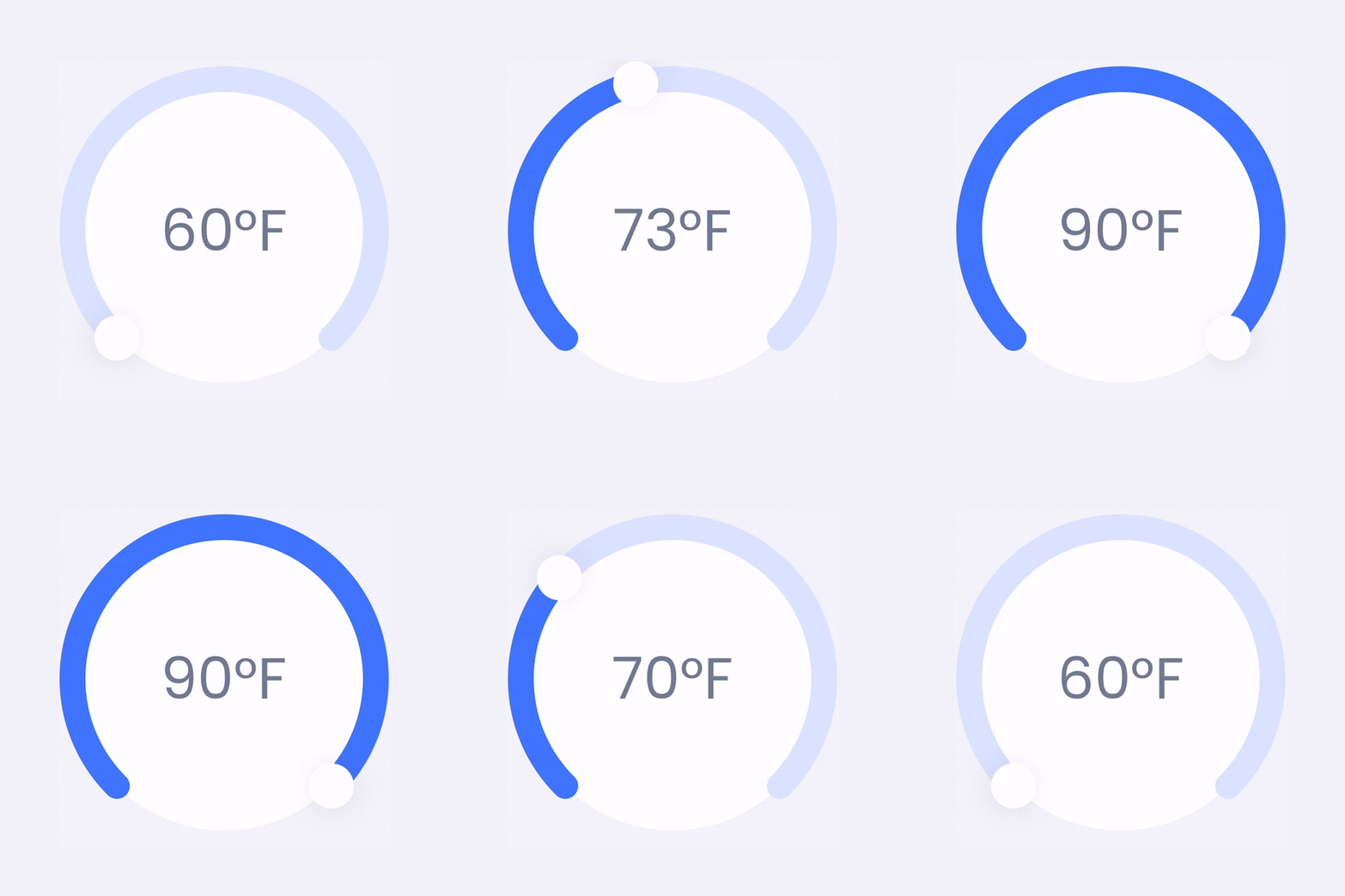
Circular Slider Sample

How to Use It

To use the Circular Slider control in your application, follow these steps:

XAML Usage

Add the Circular Slider control to your XAML page.

<grial:CircularSlider
x:Name="circularSlider"
Minimum="0"
Maximum="100"
Value="50"
TrackColor="LightGray"
ActiveColor="Blue"
ThumbColor="Red"
ValueChanged="OnCircularSliderValueChanged" />

Event Handling

Handle the ValueChanged event in your code-behind to respond to user input.

private void OnCircularSliderValueChanged(object sender, ValueChangedEventArgs e)
{
// Handle the value change
double newValue = e.NewValue;
// Update UI or perform other actions based on the new value
}
info

You can also use the commands DragCompletedCommand, DragStartedCommand, and ValueChangedCommand, to interact with the control.

Control API

Properties

NameTypeDescription
ActiveColorColorGets or sets the color of the arc between StartAngle and the angle representing the Value.
ActiveRadiusDeltadouble?Gets or sets the active area radius offset respect to the inactive area radius.
ActiveStrokeLineCapLineCapGets or sets the stroke cap of the active area.
ActiveThicknessdoubleGets or sets the stroke size of the active area.
ChildrenIList<IView>Comment to avoid XmlDocCrash
DragCompletedCommandParameterobjectGets or sets the command parameter passed to DragCompletedCommand. If nothing is specified an empty instance of EventArgs is used.
DragStartedCommandParameterobjectGets or sets the command parameter passed to DragStartedCommand. If nothing is specified an empty instance of EventArgs is used.
EndAngledoubleGets or sets the ending angle where the active area will end. Angles are inverse clockwise.
InactiveColorColorGets or sets the color of the arc between StartAngle and EndAngle.
InactiveStrokeLineCapLineCapGets or sets the stroke cap of the inactive area.
InactiveThicknessdoubleGets or sets the stroke size of the inactive area.
InnerBackgroundColorColorGets or sets the color of circumference inside the track.
MaxValuedoubleGets o sets the value that would represent the EndAngle.
MinValuedoubleGets o sets the value that would represent the StartAngle.
StartAngledoubleGets or sets the starting angle where the active area will start. Angles are inverse clockwise.
TextColorColorGets or sets the font color of the value label.
TextFontSizedoubleGets or sets the font size of the value label.
ThumbControlTemplateControlTemplateGets or sets the thumb template.
TrackColorColorGets or sets the background circle color.
ValuedoubleGets o sets the current value.
ValueChangedCommandParameterobjectGets or sets the command parameter passed to ValueChangedCommand. If nothing is specified an instance of ValueChangedEventArgs is used.
ValueFormatstringGets or sets the format to be applied to the value label.

Events

NameTypeDescription
DragCompletedEventHandlerEvent invoked when the CircularSlide drag completes.
DragStartedEventHandlerEvent invoked when the CircularSlide drag starts.
ValueChangedEventHandler<ValueChangedEventArgs>Event invoked when the CircularSlide value changes.

Commands

NameTypeDescription
DragCompletedCommandICommandGets or sets a command invoked when the CircularSlider drag completes.
DragStartedCommandICommandGets or sets a command invoked when the CircularSlider drag starts.
ValueChangedCommandICommandGets or sets a command that is invoked when the CircularSlider value changes.