Calendar
Overview
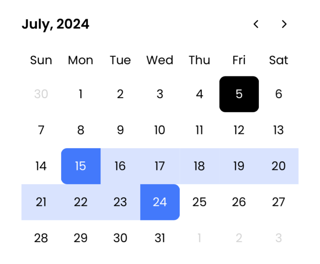
Grial's Calendar control is designed for easy date and date range selection with flexible styling options.
You can easily customize days using CalendarDayLabel control for state tweaks, and support for single and range date selections.
Getting Started
To start using the Calendar you will need to provide a template for days through DayTemplate property. You can either use CalendarDayLabel control provided by us or create the layout you want. The binding context for the data template will be a CalendarDay, you will find the available properties bellow.
Also you will need to provide the template for the control itself where the template for the calendar like in the sample below. In order to display days you will need to add at least a grid with the name of contentPart. Also yo can define weekHeaderPart or headerPart grids to display the provided templates.
Xaml
...
<ResourceDictionary>
    <ControlTemplate x:Key="CalendarStyle">
        <Grid RowDefinitions="Auto,Auto,*">
            <Grid
                Grid.Row="0"
                x:Name="headerPart"
                ColumnDefinitions="*,Auto, Auto">
                <!-- Month / Year -->
                <Label
                    Text="{ TemplateBinding
                DisplayDate,
                StringFormat='{0:MMMM, yyyy}'
            }"
                    Padding="0,10"
                    TextColor="Black"
                    FontAttributes="Bold"
                    FontSize="18"
                    VerticalOptions="Center"/>
                <!-- Back Button -->
                <Button
                    Grid.Column="1"
                    Padding="10"
                    BackgroundColor="Transparent"
                    Command="{ TemplateBinding PreviousMonthCommand }"
                    Text="{ x:Static local:GrialIconsFont.ChevronLeft }"
                    FontFamily="{ DynamicResource GrialIconsFill }"
                    FontSize="18"
                    TextColor="Black"
                    VerticalOptions="Center"/>
                <!-- Forth Button -->
                <Button
                    Grid.Column="2"
                    Padding="10"
                    BackgroundColor="Transparent"
                    Command="{ TemplateBinding NextMonthCommand }"
                    Text="{ x:Static local:GrialIconsFont.ChevronRight }"
                    FontFamily="{ DynamicResource GrialIconsFill }"
                    FontSize="18"
                    TextColor="Black"
                    VerticalOptions="Center"/>
            </Grid>
            <!-- Month/Year Back/Forth Buttons Container -->
            <Grid
                x:Name="weekHeaderPart"
                Padding="0,10"
                Grid.Row="1"
                BackgroundColor="Transparent"/>
            <!-- Week Days / Days -->
            <Grid
                x:Name="contentPart"
                Grid.Row="2"
                BackgroundColor="Transparent"/>
        </Grid>
    </ControlTemplate>

    <DataTemplate
        x:DataType="grial:CalendarDayWeek"
        x:Key="HeaderTemplate">
        <Grid>
            <Label
                HorizontalTextAlignment="Center"
                Text="{ Binding ShortName }"
                TextColor="Black"
                FontSize="16"/>
        </Grid>
    </DataTemplate>

    <DataTemplate
        x:DataType="grial:CalendarDay"
        x:Key="DayTemplate">
        <grial:CalendarDayLabel
            Padding="0,10"
            HorizontalTextAlignment="Center"
            VerticalTextAlignment="Center"
            SingleSelectionCornerRadius="8"
            StartRangeCornerRadius="8,0,8,0"
            EndRangeCornerRadius="0,8,0,8"
            MiddleRangeCornerRadius="0,0,0,0"
            CurrentMonthDateTextColor="Black"
            TextColor="Black"
            OutOfBoundsTextColor="LightGray"
            OtherMonthDateTextColor="LightGray"
            DateFromOtherMonthTextColor="LightGray"
            DisabledDateTextColor="Gray"
            Text="{ Binding Date, StringFormat='{0:%d}' }"
            BackgroundColor="Transparent"
            CurrentMonthDateBackgroundColor="Transparent"
            DateFromOtherMonthBackgroundColor="Transparent"
            SelectedDateTextColor="White"
            SelectedDateBackgroundColor="#3F75FF"
            MiddleRangeTextColor="Black"
            MiddleRangeBackgroundColor="#D9E3FF"
            TodayBackgroundColor="Black"
            TodayCornerRadius="8"
            TodayTextColor="White"
            FontSize="16"
            HeightRequest="48"/>
    </DataTemplate>
</ResourceDictionary>
...
<!-- CALENDAR -->
<grial:Calendar
    SelectedDate="{ Binding SelectedDate, Mode=TwoWay }"
    SelectedRange="{ Binding SelectedRange, Mode=TwoWay }"
    ControlTemplate="{ DynamicResource CalendarStyle }"
    WeekDayTemplate="{ DynamicResource HeaderTemplate }"
    DayTemplate="{ DynamicResource DayTemplate }"
    SelectionMode="Range"
    VerticalOptions="Start"/>
...
CSharp
internal class CalendarSampleViewModel : ObservableObject
{
	public CalendarSampleViewModel()
	{
		StartDate = DateTime.ParseExact($"01/{DateTime.Now.Month:00}/{DateTime.Now.Year}", "dd/MM/yyyy", CultureInfo.InvariantCulture);
		EndDate = GetLastDayOfMonth(StartDate.AddMonths(5));
	}

	private DateTime _selectedDate;
	private (DateTime, DateTime)? _selectedRange;

	public DateTime SelectedDate
	{
		get => _selectedDate;
		set => SetProperty(ref _selectedDate, value);
	}

	public (DateTime, DateTime)? SelectedRange
	{
		get => _selectedRange;
		set => SetProperty(ref _selectedRange, value);
	}

	public DateTime StartDate { get; }
	public DateTime EndDate { get; }

	private static DateTime GetLastDayOfMonth(DateTime dateTime) =>
		new DateTime(dateTime.Year, dateTime.Month, DateTime.DaysInMonth(dateTime.Year, dateTime.Month));
}
Control API
Calendar
Properties
| Name | Type | Description |
|---|---|---|
| Culture | CultureInfo | Gets or sets the culture of the Calendar. |
| DayBindingContextResolver | Func<DateTime, object> | Gets or sets binding context resolver for Calendar days. |
| DayTemplate | DataTemplate | Gets or sets the template for the display of Calendar days. Default empty DataTemplate. |
| DisableDatePredicate | Func<DateTime, bool> | Gets or sets the predicate to check dates availability. |
| DisablePastDates | bool | Gets or sets if past dates are disabled. Default False. |
| DisplayDate | DateTime | Gets or sets the date you want to display. This will show the entire month of that day. |
| DisplayDateChangedCommandParameter | object | Gets or sets the command parameter passed to DisplayDateChangedCommand. If nothing is specified an instance of CalendarDisplayDateChangedEventArgs is used. |
| EndDate | DateTime? | Gets or sets the end date of the Calendar bounds. Default null. |
| FirstDayOfWeek | DayOfWeek? | Gets or sets the first day of the week to start drawing with. Default null. |
| SelectedDate | DateTime? | Gets or sets the selected date if selection allows single day selection and there is not a range selection. Default null. |
| SelectedRange | (DateTime, DateTime)? | Gets or sets the selected range if selection allows range selection. Default null. |
| SelectionChangedCommandParameter | object | Gets or sets the command parameter passed to SelectionChangedCommand. If nothing is specified an instance of CalendarSelectionChangedEventArgs is used. |
| SelectionMode | CalendarSelectionMode | Gets or sets the selection mode of the Calendar. Default CalendarSelectionMode.Range. |
| StartDate | DateTime? | Gets or sets the start date of the Calendar bounds. Default null. |
| WeekDayTemplate | DataTemplate | Gets or sets the template for the display of Calendar week days. Default empty DataTemplate. |
Events
| Name | Type | Description |
|---|---|---|
| DisplayDateChanged | EventHandler<CalendarDisplayDateChangedEventArgs> | Event invoked when Calendar DisplayDate changes. |
| SelectionChanged | EventHandler<CalendarSelectionChangedEventArgs> | Event invoked when Calendar selection changes. |
Commands
| Name | Type | Description |
|---|---|---|
| DisplayDateChangedCommand | ICommand | Gets or sets a command invoked when the Calendar DisplayDate changes. |
| NextMonthCommand | ICommand | Gets a command to invoke when you want to move to next month. |
| PreviousMonthCommand | ICommand | Gets a command to invoke when you want to move to previous month. |
| SelectionChangedCommand | ICommand | Gets or sets a command invoked when the Calendar selection changes. |
CalendarDay
Properties
| Name | Type | Description |
|---|---|---|
| Data | object | Gets data from the calendar DayBindingContextResolver property. |
| Date | DateTime | Gets the date this calendar day is representing. |
| IsCurrentMonth | bool | Gets if day is displayed month. |
| IsDateFromOtherMonth | bool | Gets if day is from other month. |
| IsDisabled | bool | Gets if day is disabled. |
| IsOutOfCalendarBounds | bool | Gets if day is out of calendar bounds. |
| IsRangeEnd | bool | Gets if day is the ending of a range selection. |
| IsRangeMiddle | bool | Gets if day is in the middle of a range selection. |
| IsRangeStart | bool | Gets if day is the beginning of a range selection. |
| IsSingleSelection | bool | Gets if day is in a single selection. |
| IsToday | bool | Gets if day is today. |
| Selected | bool | Gets if day is selected. |
Events
| Name | Type | Description |
|---|---|---|
| PropertyChanged | PropertyChangedEventHandler | Occurs when a property value changes. |
CalendarDayLabel
Properties
| Name | Type | Description |
|---|---|---|
| BackgroundColor | Color | Gets or sets the default background color to use to be used. |
| CornerRadius | CornerRadius | Gets or sets the default corner radius to use. |
| CurrentMonthDateBackgroundColor | Color | Gets or sets the background color to use if day is from current month. |
| CurrentMonthDateTextColor | Color | Gets or sets the text color to use if day is in current month. |
| DateFromOtherMonthBackgroundColor | Color | Gets or sets the background color to use if day is from other month. |
| DateFromOtherMonthTextColor | Color | Gets or sets the text color to use if day is from other month. |
| DisabledDateBackgroundColor | Color | Gets or sets the background color to use if day is disabled. |
| DisabledDateTextColor | Color | Gets or sets the text color to use if day is disabled. |
| EndRangeBackgroundColor | Color | Gets or sets the background color to use if day is the end of a range selection. |
| EndRangeCornerRadius | CornerRadius | Gets or sets the corner radius to use if day is the end of a range selection. |
| EndRangeTextColor | Color | Gets or sets the background color to use if day is the end of a range selection. |
| MiddleRangeBackgroundColor | Color | Gets or sets the background color to use if day is in the middle of a range selection. |
| MiddleRangeCornerRadius | CornerRadius | Gets or sets the corner radius to use if day is in the middle of a range selection. |
| MiddleRangeTextColor | Color | Gets or sets the text color to use if day is in the middle of a range selection. |
| OtherMonthDateBackgroundColor | Color | Gets or sets the background color to use if day is from other month. |
| OtherMonthDateTextColor | Color | Gets or sets the text color to use if day is from other month. |
| OutOfBoundsBackgroundColor | Color | Gets or sets the background color to use if day out of calendar bounds. |
| OutOfBoundsTextColor | Color | Gets or sets the text color to use if day is out of calendar bounds. |
| SelectedDateBackgroundColor | Color | Gets or sets the background color to use if day is selected. |
| SelectedDateTextColor | Color | Gets or sets the text color to use if day is selected. |
| SingleSelectionCornerRadius | CornerRadius | Gets or sets the corner radius to use if day selected in a single selection. |
| StartRangeBackgroundColor | Color | Gets or sets the background color to use if day is the start of a range selection. |
| StartRangeCornerRadius | CornerRadius | Gets or sets the corner radius to use if day is the start of a range selection. |
| StartRangeTextColor | Color | Gets or sets the text color to use if day is the start of a range selection. |
| TextColor | Color | Gets or sets the default text color to use to be used for texts. |
| TodayBackgroundColor | Color | Gets or sets the background color to use if day is today. |
| TodayCornerRadius | CornerRadius | Gets or sets the corner radius to use if day is today. |
| TodayTextColor | Color | Gets or sets the text color to use if day is today. |