Repeater
Overview
The Grial Repeater control renders a collection of elements in a linear layout. It can render vertically (similar to an ListView) and also horizontally:

It supports selection and reacts to changes in the data source if it implements INotifyCollectionChanged.
The rendering is always virtualized, which means that only the elements that are visible are actually part of the visual tree making it very efficient even when handling a big set of data.
Repeater Properties
| Name | Type | Description |
|---|---|---|
| SelectedItem | object | Gets or sets the currently selected item from the ItemsSource. |
| SelectionMode | RepeaterSelectionMode | Gets or sets a value that controls if items can be selected or not. Available values are: |
| InitialSelection | RepeaterInitialSelection | Gets or sets a value that controls if the first repeated item will be selected or not when the control is loaded. Available values are: |
| ScrollBarVisibility | ScrollBarVisibility | Gets or sets a value that controls if the ScrollBar will be visible or not. Available values are: |
| ScrollPadding | Thickness | Gets or sets a value that controls the Padding of the ScrollBar. |
| ScrollPosition | double | Gets or sets a value that scrolls the content using coordinates. |
| Spacing | double | Gets or sets a value that controls the available space between each rendered item. |
| ItemSize | double | Gets or sets a value that controls the height or width (depending on Orientation value) of each repeated item. |
| Orientation | RepeaterOrientation | Gets or sets the value which indicates the direction which child elements are positioned. Available values are: |
| ItemsSource | IList | Gets or sets the source of items to template and display. |
| ItemTemplate | DataTemplate | Gets or sets the default items DataTemplate to apply to the ItemsSource. |
| SelectedItemTemplate | DataTemplate | Gets or sets the selected item DataTemplate to apply to the ItemsSource. |
Repeater Events and Commands
| Name | Type | Description |
|---|---|---|
| ItemSelected | Event | Fired when an item is selected. |
| ItemSelectedCommand | ICommand | Executed when an item is selected. The item goes as the command parameter. |
Examples
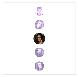
Let’s see a basic sample code that shows how to interact with the Repeater and its properties, the final result will look like the following image:
This sample simply repeats a basic template showing a circular image. The content will not be selectable since it is not explicitly set in the code.
<!--ADDED A FRAME TO HELP VISUALIZING THE BOUNDRIES OF THE REPEATER-->
<Frame
    BorderColor="LightGray"
    HasShadow="false"
    CornerRadius="0"
    Padding="0"
>
    <grial:Repeater
        Spacing="8"
        Padding="0,10"
        ScrollPadding="10,0"
        ItemSize="48"
    >
        <!--THE DATA THAT WILL BE RENDERED-->
        <grial:Repeater.ItemsSource>
            <x:Array Type="{ x:Type x:String }">
                <x:String>friend_01.png</x:String>
                <x:String>friend_02.png</x:String>
                <x:String>friend_03.png</x:String>
                <x:String>friend_04.png</x:String>
                <x:String>friend_05.png</x:String>
            </x:Array>
        </grial:Repeater.ItemsSource>

        <!--DEFAULT ITEM TEMPLATE-->
        <grial:Repeater.ItemTemplate>
            <DataTemplate>
                <local:CircleCachedImage
                    Source="{ Binding . }"
                    Style="{ StaticResource Avatar }"
                />
            </DataTemplate>
        </grial:Repeater.ItemTemplate>
    </grial:Repeater>
</Frame>
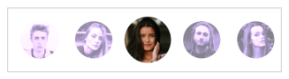
Now, we will make our Repeater selectable and to get a better visual result let's also add a SelectedItemTemplate.
The final result will look like the picture below:
- When no item is selected
-
- When an item is selected
-

And the code will be the following:
<!--ADDED A FRAME TO HELP VISUALIZING THE BOUNDARIES OF THE REPEATER-->
<Border
    Stroke="LightGray"
>
    <grial:Repeater
        Spacing="8"
        Padding="0,10"
        ScrollPadding="10,0"
        ItemSize="48"

        SelectionMode="Single"
    >
        <!--THE DATA THAT WILL BE RENDERED-->
        <grial:Repeater.ItemsSource>
            <x:Array Type="{ x:Type x:String }">
                <x:String>friend_01.png</x:String>
                <x:String>friend_02.png</x:String>
                <x:String>friend_03.png</x:String>
                <x:String>friend_04.png</x:String>
                <x:String>friend_05.png</x:String>
            </x:Array>
        </grial:Repeater.ItemsSource>

        <!--DEFAULT ITEM TEMPLATE-->
        <grial:Repeater.ItemTemplate>
            <DataTemplate>
                <local:CircleCachedImage
                    Source="{ Binding . }"
                    Style="{ StaticResource Avatar }"

                    Opacity=".5" Scale=".8"
                >
                    <!--
                    LET'S MAKE THE IMAGE NOT ONLY SMALLER AND TRANSLUCID,
                    BUT ALSO WITH SOME TINTED EFFECT
                    -->
                    <local:CircleCachedImage.Transformations>
                        <fftransformations:GrayscaleTransformation/>
                        <fftransformations:TintTransformation HexColor="#4D29BC" />
                    </local:CircleCachedImage.Transformations>

                </local:CircleCachedImage>
            </DataTemplate>
        </grial:Repeater.ItemTemplate>


        <!--SELECTED ITEM TEMPLATE-->
        <grial:Repeater.SelectedItemTemplate>
            <DataTemplate>
                <local:CircleCachedImage
                    Scale="1"
                    BorderColor="#A32CA3" BorderSize="0"
                    Source="{ Binding . }"
                    Style="{ StaticResource Avatar }"
                    DownsampleToViewSize="true"
                />
            </DataTemplate>
        </grial:Repeater.SelectedItemTemplate>
    </grial:Repeater>
</Border>
Now, every time we select an item we will see a more "dramatic" effect. That happens because we made the default items to render smaller and with some transparency.
Finally, let's change the Orientation property to render the Repeater vertically by adding the following:
...
    <grial:Repeater

        Orientation="Vertical"
    >
...