Popups
Overview
Grial includes a full collection of beautiful dialogs and pop-us made in XAML.
Grial Popups are based on Rg.Plugins.Popup when targeting Xamarin.Forms, and on Mopups when targeting .NET MAUI.
Our designs cover the most common scenarios and they can be easily adapted to any needs since they are very flexible.
All popups inherit from PopupPage and they support animations.
All the popups templates (XAML) are located in the following folder inside Grial:
Grial |_ Controls |_ Popups |_ CustomActionSheet.xaml |_ IrregularDialog.xaml |_ NotificationPopup.xaml |_ SimpleDialog.xaml |_ SimpleDialogNoTitle.xaml |_ SimpleDialogNoTitleInverse.xaml
Resources
All popups resources that affect their look and feel are located in the file:
Grial |_ Controls |_ Popups |_ Resources |_ DialogsResources.xaml
These dialog resources are based on Grial themes, so if you change the theme, the dialogs will update accordingly.
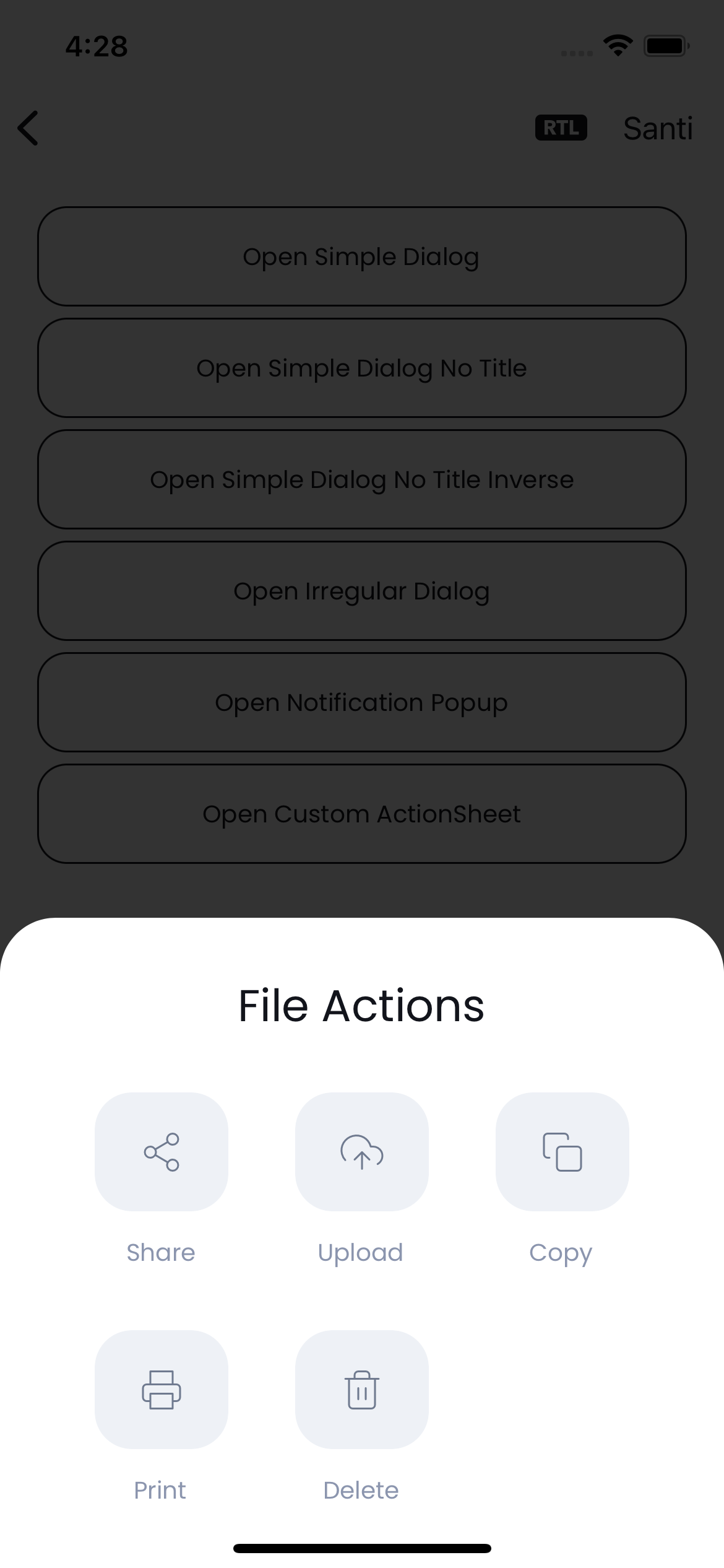
Custom Action Sheet
The custom action sheet as its name suggest is a fully customizable action sheet.
Can be found here:
Grial |_ Controls |_ Popups |_ CustomActionSheet.xaml
By default, it displays from bottom to top, but can be easily modified inside the animation XAML block:
<pages:PopupPage.Animation>
    <animations:MoveAnimation
        PositionIn="Bottom"
        PositionOut="Bottom"
    />
</pages:PopupPage.Animation>
The data received through bindings by the CustomActionSheet is:
Title(string)Action(list)
For the Action items the data is:
Icon(char)Label(string)
Irregular Dialog
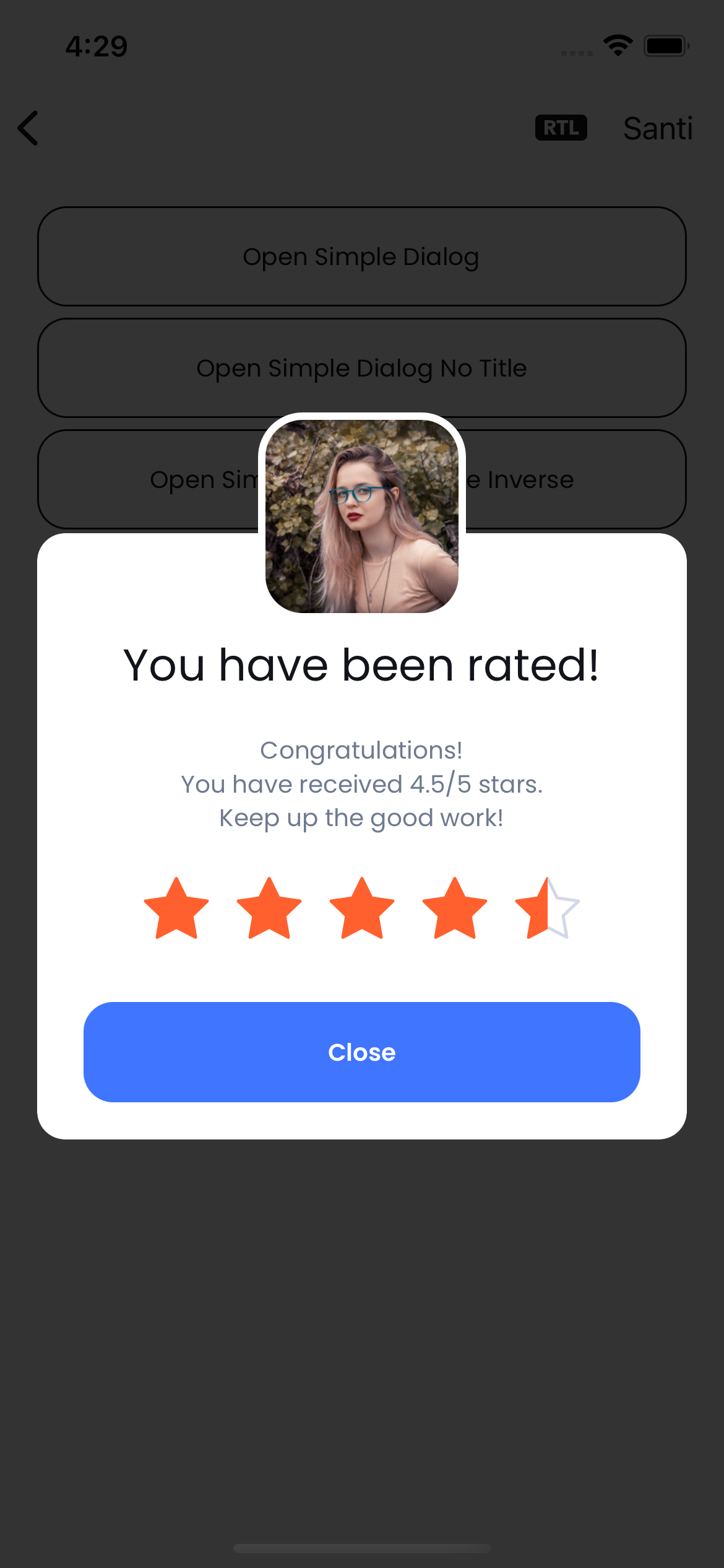
A fully styleable dialog not limited to a squared/rectangle shape which make them very visually appealing. Allows displaying any content such as rating control, badges, checkboxes, videos, etc. It can be easily bound to any data and its layout is easy to tweak.
Can be found here:
Grial |_ Controls |_ Popups |_ IrregularDialog.xaml
Notification Popup
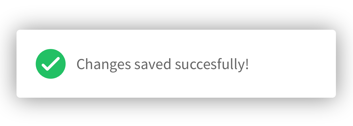
A simple notification popup.
Can be found here:
Grial |_ Controls |_ Popups |_ NotificationPopup.xaml
It animates from top by default but can be easily changed through the animation block:
<pages:PopupPage.Animation>
    <animations:MoveAnimation
        PositionIn="Top"
        PositionOut="Top"
    />
</pages:PopupPage.Animation>
The data received through bindings by the NotificationPopup is:
Message(string)
Simple Dialog
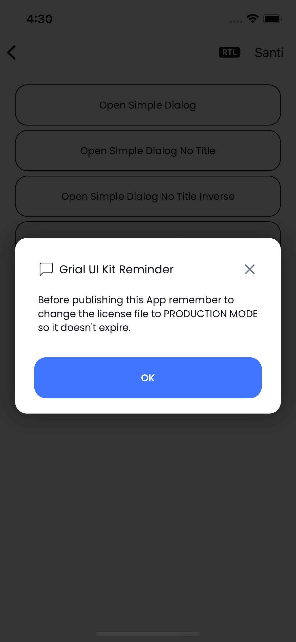
As its name suggest, it is a popup that displays a simple dialog.
It is an excellent alternative to the DisplayAlert method from MAUI.
Can be found here:
Grial |_ Controls |_ Popups |_ SimpleDialog.xaml
Its layout is structured to support the following regions:
- Title
- Icon
- Title
- Close Icon
- Content
- Footer
- Button/s
No Title
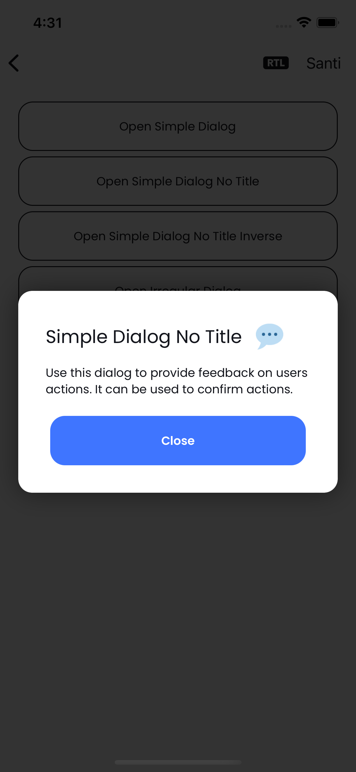
A variant from SimpleDialog.xaml that doesn't have a title.
Grial |_ Controls |_ Popups |_ SimpleDialogNoTitle.xaml
No Title Inverse
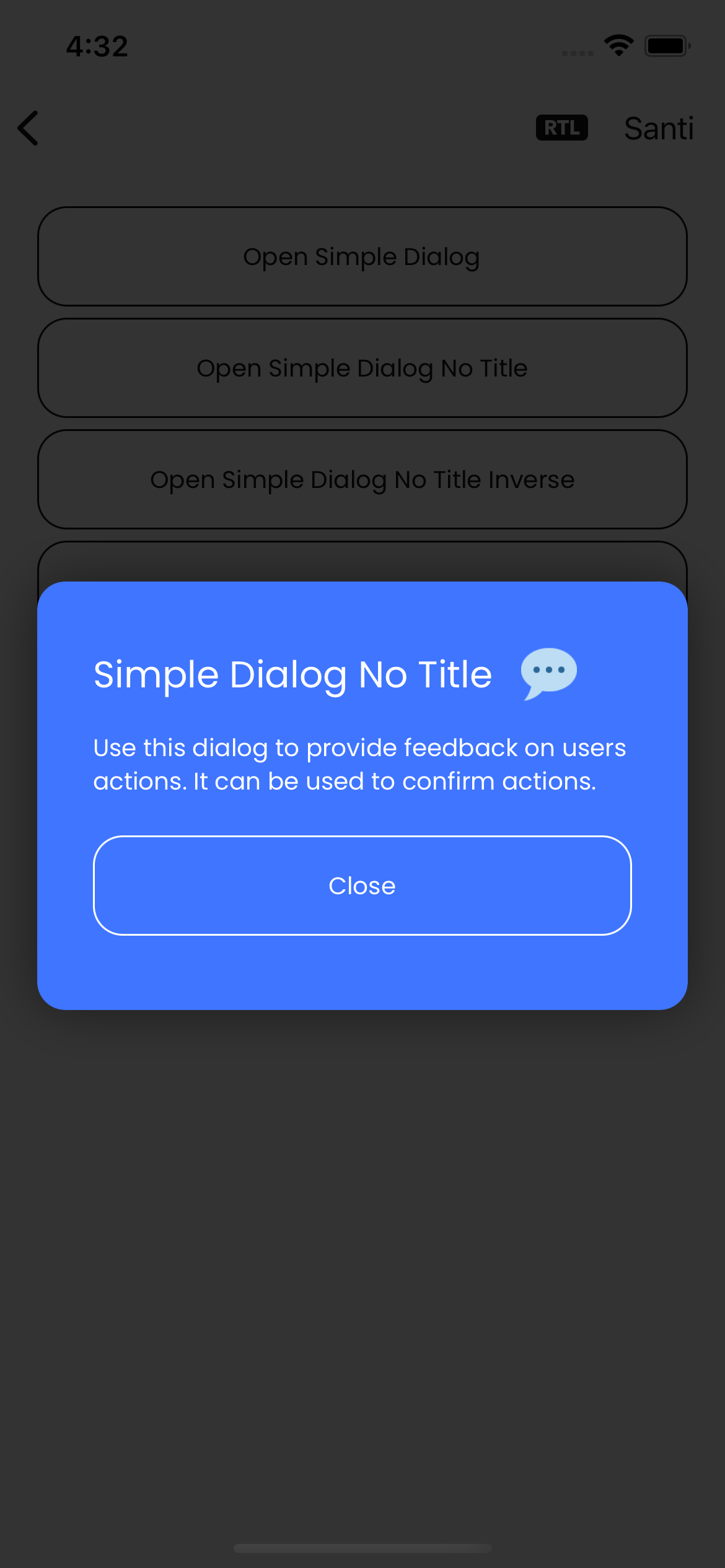
Can be found here:
Grial |_ Controls |_ Popups |_ SimpleDialogNoTitleInverse.xaml
A variation from SimpleDialogNoTitle.xaml showing an inverse color scheme.
Grial |_ Controls |_ Popups |_ SimpleDialogNoTitle.xaml