Grial Map
GrialMap is a map control with a powerful customization that allows you to implement complex designs in a fast and easily way. With custom templates you can customize the pin marks and the information windows. The control also provides many properties that allows you to change the appearance of the map.
Grial Map extends the Xamarin's Map Control so you can do whatever you are be able to do with the Map Control. You can check the control's documentation here.

Setting up the initial position
GrialMap offers a simple way to define the map's initial position: just bind a ViewModel property of type Xamarin.Forms.Map.Position to the GrialMap InitialPosition property.
View Model
using Xamarin.Forms.Maps;

public class MyViewModel
{
    //...
    public Position InitialPosition => new Position(_startLatitude, _startLongitude);
    //...
}
Xaml
<grial:Map
    InitialPosition="{ Binding InitialPosition }"
    />
Custom Pins
You can define the property ItemTemplate with a DataTemplate and its child has to be a grial:PinMark, as the example:
Xaml
 <grial:Map
    MapStyle="Dark"
    ItemsSource="{ Binding Places }">
    <grial:Map.ItemTemplate>
        <DataTemplate>
            <grial:Pin
                Position="{ Binding Position }"
                Label="{ Binding Description }">
                <Grid
                    BackgroundColor="Transparent"
                    HeightRequest="75"
                    WidthRequest="50"
                    RowSpacing="0"
                    RowDefinitions="50,25">
                    <!-- BG -->
                    <Frame
                        Padding="0"
                        BackgroundColor="{ DynamicResource BasePageColor }"
                        HorizontalOptions="FillAndExpand"
                        VerticalOptions="FillAndExpand"
                        CornerRadius="25"
                    />

                    <!-- ACCENT CIRCLE -->
                    <Frame
                        Padding="0"
                        BackgroundColor="{ DynamicResource AccentColor }"
                        HorizontalOptions="Center"
                        VerticalOptions="Center"
                        HeightRequest="26"
                        WidthRequest="26"
                        CornerRadius="13"
                        />

                    <!-- DOWN ARROW -->
                    <Label
                        Margin="0,-20,0,0"
                        Grid.Row="1"
                        Style="{ StaticResource FontIcon }"
                        FontSize="40"
                        Text="{ x:Static local:GrialIconsFont.ShapeArrowDown }"
                        TextColor="{ DynamicResource BasePageColor }"
                        HorizontalOptions="Center"
                    />
                </Grid>
            </grial:Pin>
        </DataTemplate>
    </grial:Map.ItemTemplate>
</grial:Map>
tip
Since BoxView has some issues in Android when the pin is drawn, we recommend to using Frame instead
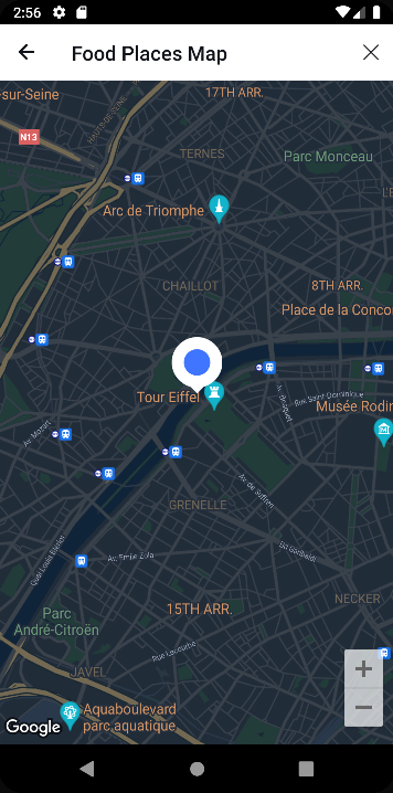
As you can see, grial:Pin extends Xamarin.Forms.Map.Pin so you can use all the features that it provides. Also you can add content to the pin and it will be used as a template for all the pins in the map. You can see the result of the previous example:
caution
The content of the grial:Pin has to define explicitly the size, in the example, the Grid sets the HeightRequest and the WidthRequest of the pin.
Bindable Properties
| Name | Type | Description |
|---|---|---|
| HidePinMarks | bool | If it is true, it would hide all the pin marks in the map. By default is false. |
| MapStyle | MapStyle | The MapStyle type is an enum with the values Light and Dark. Set the Light value if you want to display a Light mode map or pick the Dark value if you want to display the Dark mode map. By default is Light. |
| InitialPosition | Position | Gets or sets the position that would be displayed on the map when this appears on the screen. The value type is Xamarin.Forms.Maps.Position |
| UseDefaultPinsWhenZoomIs | double | Gets or sets the zoom level from which the map will change the pin markers appearance between the default design to the custom template design. By default the value is -1, which means disabled |
| ZoomLevel | double | Gets the current zoom level. This isn't a BindableProperty |
Commands and Events
| Name | Type | Description |
|---|---|---|
| PinClickedCommand | ICommand | Executed when a PinMark is clicked. The PinMark item goes as the command parameter. |
| ZoomLevelChanged | EventHandler<double> | Fired when the zoom level changes. The zoom level value goes as the double arg. |
| PinClicked | EventHandler<Pin> | Fired when a PinMark is clicked. The PinMArk clicked goes as the Pin arg. |