Floating Menu
The Floating Menu is a flexible control that lets you include primary actions on your pages without interfering with the main layout. Plus, it's beautiful and fun to use, giving a nice touch to your apps.

Getting Started
To start working with the Floating Menu you have to specify two templates:
ControlTemplate- sets the looks of the button when the menu is closedCloseButtonTemplate- sets the looks of the button with the menu is opened
Check Grial's ExplorerFlow to see the Floating Menu in action.
<!-- ... -->
<!-- FLOATING MENU BUTTON TEMPLATE -->
<ControlTemplate x:Key="FloatingMenu_ControlTemplate">
    <grial:CardView
        CornerRadius="25"
        HeightRequest="50"
        WidthRequest="50"
        ShadowOpacity="0.2"
        ShadowSize="15"
        grial:Effects.ShadowIOSOffset="10"
        BackgroundColor="{ DynamicResource BasePageColor }"
        Padding="0">
        <Label
            HorizontalOptions="Center"
            VerticalOptions="Center"
            FontSize="30"
            FontFamily="{ StaticResource IconsFontFamily }"
            Text="{ x:Static local:GrialIconsFont.Plus }"
            TextColor="{ DynamicResource AccentColor }"
        />
    </grial:CardView>
</ControlTemplate>

<!-- FLOATING MENU CLOSE BUTTON TEMPLATE -->
<ControlTemplate x:Key="FloatingMenu_CloseButtonControlTemplate">
    <Frame
        HasShadow="False"
        CornerRadius="25"
        HeightRequest="50"
        WidthRequest="50"
        BackgroundColor="{ DynamicResource AccentColor }"
        BorderColor="Transparent"
        Padding="0">
        <Label
            HorizontalOptions="Center"
            VerticalOptions="Center"
            FontSize="30"
            FontFamily="{ StaticResource IconsFontFamily }"
            Text="{ x:Static local:GrialIconsFont.Close }"
            TextColor="{ DynamicResource OverDarkTextColor }"
        />
    </Frame>
</ControlTemplate>

<!-- ... -->

<grial:FloatingMenu
    ControlTemplate="{ StaticResource FloatingMenu_ControlTemplate }"
    CloseButtonTemplate="{ StaticResource FloatingMenu_CloseButtonControlTemplate }"
    />
Working with the menu items
Now that the buttons open/close buttons are ready, let's add the menu items. You have 2 ways to do this:
- through Bindings using the
ItemsSourceproperty - through inline XAML code using
FloatingMenuItemcontrols
ItemsSource
The ItemTemplate defines how the items will look when using bindings to load the menu items,
ViewModel
public class ViewModel
{
    //...
    public List<string> MenuOptions { get; } = new List<string>() { "Option 1", "Option 2", "Option 3"};
    //...
}
Xaml
<grial:FloatingMenu
    ItemsSource="{ Binding MenuOptions }"
    ItemsAlignment="End"
    Spacing="30"
    ControlTemplate="{ StaticResource FloatingMenu_ControlTemplate }"
    CloseButtonTemplate="{ StaticResource FloatingMenu_CloseButtonControlTemplate }"
    >
    <grial:FloatingMenu.ItemTemplate>
        <DataTemplate>
            <grial:ExtendedGrid
                Padding="5"
                grial:Effects.CornerRadius="20"
                BackgroundColor="{ DynamicResource AccentColor }"
                >
                <!-- BG -->
                <BoxView
                    CornerRadius="15"
                    BackgroundColor="{ DynamicResource BasePageColor }"
                    />

                <!-- TEXT -->
                <Label
                    Margin="10,0"
                    Text="{ Binding . }"
                    VerticalOptions="Center"
                    HorizontalOptions="Center"
                    />
            </grial:ExtendedGrid>
        </DataTemplate>
    </grial:FloatingMenu.ItemTemplate>
</grial:FloatingMenu>
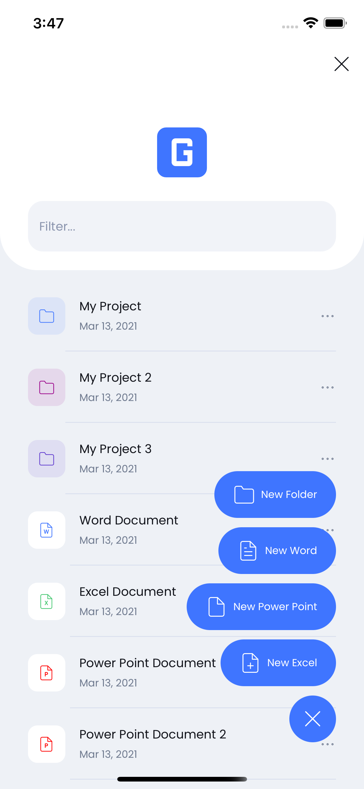
This code leads to the following result:
Floating Menu Items
The other way to define the menu items is through direct XAML code. This is useful when the type and kind of menu items is fixed (i.e. they don't depend on the data) For this mode to work, you have to define the ItemControlTemplate property as the following example shows.
<grial:FloatingMenu
    ItemsAlignment="End"
    Spacing="30"
    ControlTemplate="{ StaticResource FloatingMenu_ControlTemplate }"
    CloseButtonTemplate="{ StaticResource FloatingMenu_CloseButtonControlTemplate }"
    >
    <grial:FloatingMenu.ItemControlTemplate>
        <ControlTemplate>
            <grial:ExtendedGrid
                Padding="5"
                grial:Effects.CornerRadius="20"
                BackgroundColor="{ DynamicResource AccentColor }"
                >
                <!-- BG -->
                <BoxView
                    CornerRadius="15"
                    BackgroundColor="{ DynamicResource BasePageColor }"
                    />

                <!-- TEXT -->
                <Label
                    Margin="10,0"
                    Text="{ TemplateBinding Text }"
                    VerticalOptions="Center"
                    HorizontalOptions="Center"
                    />
            </grial:ExtendedGrid>
        </ControlTemplate>
    </grial:FloatingMenu.ItemControlTemplate>

    <grial:FloatingMenuItem
        Text="Option 1"
        />

    <grial:FloatingMenuItem
        Text="Option 2"
        />

    <grial:FloatingMenuItem
        Text="Option 3"
        />
</grial:FloatingMenu>
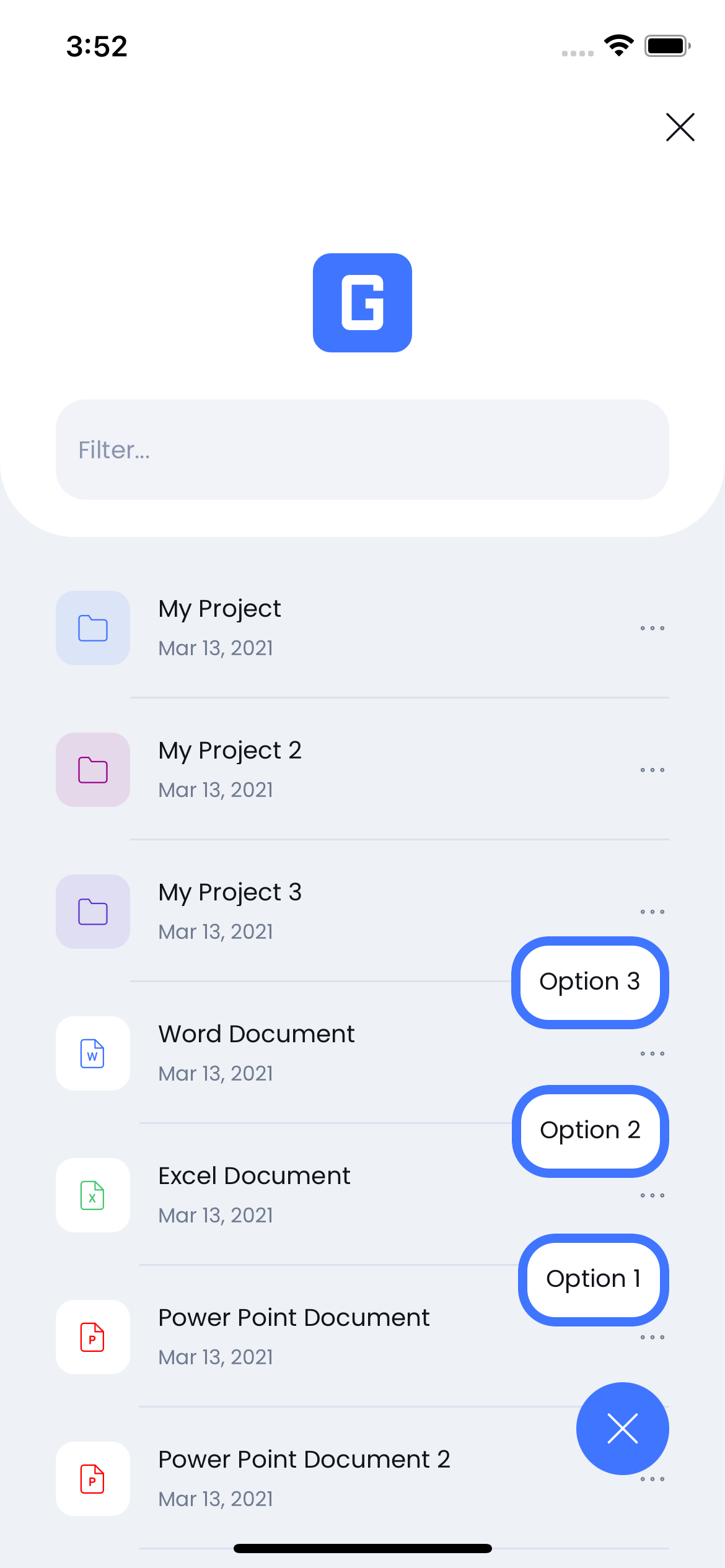
This code leads to the following result:
Note that the control template uses TemplateBindings to map the FloatingMenuItem properties within the template's XAML.
FloatingMenuItem control
The FloatingMenuItem is the control used for the menu items, even if the items are bound using the ItemsSource property as shown above. It extends from ContentView so you can put any View inside them, and use a ContentPresenter within the ItemControlTemplate to display that View.
The FloatingMenuItem also define common properties to cover most menu item scenarios. You can map those properties inside the ItemControlTemplate through TemplateBindings.
| Name | Type |
|---|---|
| Text | string |
| IconText | string |
| TapCommand | ICommand |
| TapCommandParameter | object |
| FontFamily | string |
| IconFontFamily | string |
Floating Menu Bindable Properties
| Name | Type | Description |
|---|---|---|
| IconText | string | Gets or sets the icon glyph that will be displayed in the menu button |
| IconFontFamily | string | Gets or sets the font family of the icon that will be displayed in the menu button |
| ItemTemplate | DataTemplate | You can define the DataTemplate of the items that will be displayed when the menu is opened. This items are generated by the collection specified in the ItemsSource property. |
| ItemsSource | IEnumerable | Gets or sets the items collection that will be used to build the menu items |
| ItemControlTemplate | ControlTemplate | Gets or sets the ControlTemplate of the items that will be displayed when the menu is opened. |
| Direction | FloatingMenuLinearDirection | Gets or sets the direction that the menu will display the items, taking the menu button as reference. By default the direction is Top. The possible values are: Top, Right, Bottom and Left. |
| OverlayBackgroundColor | Color | Gets or sets the background color when the menu is opened |
| Items | ObservableCollection<FloatingMenuItem> | Gets or sets the collection of FloatingMenuItem, you can define the items in the FloatingMenu content in the XAML. |
| Spacing | float | Gets or sets the spacing value between items, when the menu is opened. |
| CloseButtonTemplate | ControlTemplate | Gets or sets the ControlTemplate of the close button that will appear when the menu is opened. |
| AnimationSpeed | AnimationSpeed | Gets or sets the animation speed when the menu opens or closes. |
| ItemsAlignment | ItemAlignment | Gets or sets the items alignment taking by reference the axis which the items are displayed. By default the value is Start. The possible values are: Start, Center and End. |