Data Grid
Overview
The DataGrid is meant for displaying tabular data. You can easily customize its look with style properties such as header background color, odd row color, etc., or go deeper into customization using templates for cells and headers.
To display data the DataGrid needs at least:
- a list of column definitions set in the
ColumnDefinitionsproperty; they indicate how the data source will be organized in columns (checkDataGridColumntype below) - an enumerable set in the
ItemsSourceproperty that is the actual data to display in the rows
There are 2 ways to define how the data source is mapped into a column:
- the
BindingPathproperty of the column; the DataGrid creates a Label on each cell with its Text bound through this path - the
CellTemplateproperty of the column; by using aDataTemplateyou can define a free visual hierarchy to use in each cell
The DataGrid supports sorting and selection.
DataGrid Properties
| Name | Type | Description |
|---|---|---|
| ColumnDefinitions | IList<DataGridColumn> | Collection of column definitions |
| ColumnSeparatorColor | Color | Column separators color |
| ColumnSeparatorWidth | double | Column separators width |
| EvenRowsBackgroundColor | Color | Even rows background color |
| GridSeparatorVisibility | DataGridSeparatorVisibility | Separators visibility: DataGridSeparatorVisibility.None, DataGridSeparatorVisibility.Horizontal, DataGridSeparatorVisibility.Vertical, DataGridSeparatorVisibility.All |
| HeaderColumnSeparatorColor | Color | Header column separators color |
| HeaderColumnSeparatorWidth | double | Header column separators width |
| HeaderRowBackgroundColor | Color | Header background color |
| HeaderRowHeight | double | Header height |
| HeaderRowSeparatorColor | Color | Header row separator color |
| HeaderRowSeparatorHeight | double | Header row separator height |
| HeaderSeparatorVisibility | DataGridSeparatorVisibility | Header separators visibility: DataGridSeparatorVisibility.None, DataGridSeparatorVisibility.Horizontal, DataGridSeparatorVisibility.Vertical, DataGridSeparatorVisibility.All |
| HorizontalScrollBarVisibility | ScrollBarVisibility | Horizontal scrollbar visibility: ScrollBarVisibility.Default, ScrollBarVisibility.Always, ScrollBarVisibility.Never |
| ItemsSource | IEnumerable | Enumerable data source to display as rows. |
| OddRowsBackgroundColor | Color | Odd rows background color |
| RowHeight | double | Rows height |
| RowSeparatorColor | Color | Row separators color |
| RowSeparatorHeight | double | Row separators height |
| SelectedBackgroundColor | Color | Background color for selected item |
| SelectedItem | object | Selected row item |
| SelectionMode | DataGridSelectionMode | Selection mode (DataGridSelectionMode.None, DataGridSelectionMode.Row) |
| ScrollProgressY | double | Readonly property to get current vertical scroll |
| HeaderTemplate | ControlTemplate | Defines the template to apply to the header. HeaderHeight must be set in order to be displayed. |
| HeaderHeight | double | Defines the height the header will have in order to be displayed and react to the scroll. |
| EnableHorizontalScrolling | bool | Used to toggle horizontal scrolling. |
If you enable selection, the BindingContext of the rows should be different for each row (either different objects or different value types) as their identity is used to uniquely identify the selected row.
DataGrid Events and Commands
| Name | Type | Description |
|---|---|---|
| ItemSelected | Event | Fired when a row is selected. Args: DataGridSelectedItemChangedEventArgs { SelectedItem: object } |
| ItemSelectedCommand | ICommand | Executed when a row is selected. Receives the selected row object as parameter. |
DataGridColumn Properties
| Name | Type | Description |
|---|---|---|
| AscendingSortIcon | ImageSource | Image displayed on header when the column is sorted and sort type is Ascending |
| AscendingSortIconText | string | Icon text displayed on header when the column is sorted and sort type is Ascending, see SortIconsFontFamily |
| BindingPath | string | Binding path used to display data within an automatically created Label (ignored when using a CellTemplate) |
| CellBackgroundColor | Color | Cells background color |
| CellFontAttributes | FontAttributes | Cells text font attributes (FontAttributes.None, FontAttributes.Bold, FontAttributes.Italic) |
| CellFontFamily | string | Cells text font family |
| CellFontSize | double | Cells text font size |
| CellPadding | Thickness | Cells padding |
| CellTemplate | DataTemplate | Data template for cells, when using this property BindingPath is ignored. When using a DataTemplateSelector the selector receives the entire row unless a CellTemplateBindingContextPath is defined. |
| CellTemplateBindingContextPath | string | Optional binding path that constrains the data context of this column CellTemplate. Helps as a shortcut if there are multiple bindings in the template content with the same base path. |
| CellTextAlignment | TextAlignment` | Cells text alignment (TextAlignment.Start, TextAlignment.Center, TextAlignment.End); if not defined, numeric values are right-aligned and non-numeric values left-aligned |
| CellTextColor | Color | Cells text color |
| CellVerticalAlignment | DataGridVerticalAlignment | Cells vertical alignment (DataGridVerticalAlignment.Start, DataGridVerticalAlignment.Center, DataGridVerticalAlignment.End) |
| ColumnWidth | GridLength | Column width |
| Converter | IValueConverter | Converter applied to binding when using BindingPath |
| ConverterParameter | object | Parameter passed to converter when using BindingPath |
| DescendingSortIcon | ImageSource | Image displayed on header when the column is sorted and sort type is Descending |
| DescendingSortIconText | string | Icon text displayed on header when the column is sorted and sort type is Descending, see SortIconsFontFamily |
| HeaderBackgroundColor | Color | Header background color |
| HeaderControlTemplate | ControlTemplate | A ControlTemplate for a DataGridHeaderCell representing the content of the header cell. |
| HeaderFontAttributes | FontAttributes | Header text font attributes (FontAttributes.None, FontAttributes.Bold, FontAttributes.Italic) |
| HeaderFontFamily | string | Header text font family |
| HeaderFontSize | double | Header text font size |
| HeaderPadding | Thickness | Header padding |
| HeaderText | string | Text displayed on header |
| HeaderTextAlignment | TextAlignment | Header text alignment (TextAlignment.Start, TextAlignment.Center, TextAlignment.End) |
| HeaderTextColor | Color | Header text color |
| HeaderVerticalAlignment | DataGridVerticalAlignment | Header vertical alignment (DataGridVerticalAlignment.Start, DataGridVerticalAlignment.Center, DataGridVerticalAlignment.End) |
| IsSortable | bool | Indicates if the column is sortable or not |
| Sort | DataGridSortType | (readonly) Indicates the current sort direction (DataGridSortType.Unsorted, DataGridSortType.Ascending, DataGridSortType.Descending) |
| SortIconsFontFamily | string | Icon font family to use for displaying both AscendingSortIconText and DescendingSortIconText |
| SortIconsFontSize | double | Sorting text font size |
| StringFormat | string | String format applied to binding when using BindingPath |
| UnsortedIcon | ImageSource | Image displayed on header when the column is sortable and sort type is Unsorted |
| UnsortedIconText | string | Text displayed on header when the column is sortable and sort type is Unsorted |
DataGridColumn Commands
| Name | Type | Description |
|---|---|---|
| SortCommand | ICommand | Custom sorting command invoked when the user taps the column header. |
DataGridHeaderCell properties
DataGridHeaderCell is the backing class for the control template of headers (see HeaderControlTemplate above).
The only purpose of this class is to consume its properties through TemplateBindings inside your header template. Most of them come from the column definition itself.
| Name | Type | Description |
|---|---|---|
| AscendingSortIcon | ImageSource | Image to be used for Ascending sort |
| AscendingSortIconText | string | Icon text to be used for Ascending sort, see SortIconsFontFamily |
| CurrentSortIcon | ImageSource | Calculated sort Image according to the current column sort, usually is enough to have 1 Image in the template with its source bound to this property, no need to care for Ascending and Descending images. |
| CurrentSortIconText | string | Calculated icon text according to the current column sort, usually is enough to have 1 Label in the template with its text bound to this property, no need to care for Ascending and Descending icons. |
| DescendingSortIcon | ImageSource | Image to be used for Descending sort |
| DescendingSortIconText | string | Icon text to be used for Descending sort, see SortIconsFontFamily |
| HeaderBackgroundColor | Color | Color to be used for the background |
| HeaderFontAttributes | FontAttributes | Text to be used as the column title |
| HeaderFontFamily | string | Font family to be used for the column title text |
| HeaderFontSize | double | Font size to be used on the column title text |
| HeaderPadding | Thickness | Padding for the header |
| HeaderText | string | Text displayed on header |
| HeaderTextAlignment | TextAlignment | Text alignment to be used for the header text |
| HeaderTextColor | Color | Color to be used for the header text |
| HeaderVerticalAlignment | DataGridVerticalAlignment | Header vertical alignment |
| IsSortable | bool | True when sortable and False when not |
| Sort | DataGridSortType | Indicates the current sort direction |
| SortIconsFontFamily | string | Icon font family to be used for displaying both AscendingSortIconText and DescendingSortIconText |
| SortIconsFontSize | double | Sorting text font size |
| UnsortedIcon | ImageSource | Image to be used when Unsorted |
| UnsortedIconText | string | Icon text to be used when Unsorted sort, see SortIconsFontFamily |
DataGridHeaderCell Commands
| Name | Type | Description |
|---|---|---|
| SortCommand | ICommand | Custom sorting command invoked when the user taps the column header. |
Samples
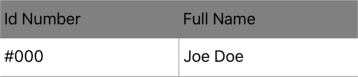
Let's see how to show a grid like the following one:
| ID Number | Full Name |
|---|---|
| #000 | Joe Doe |
The above grid has a Header and a single row, and the data has the following format (JSON notation):
{
    "MyTabularData": [
        {
            "Id"    : "#000",
            "Name"  : "Joe Doe"
        }
    ]
}
Don't forget to include the namespace
xmlns:grial="clr-namespace:UXDivers.Grial;assembly=UXDivers.Grial"
The XAML code would like the following:
<grial:DataGrid
    ItemsSource="{ Binding MyTabularData }"
>
    <grial:DataGrid.ColumnDefinitions>
        <grial:DataGridColumn
            BindingPath="Id"
            HeaderText="Id Number"
        />
        <grial:DataGridColumn
            BindingPath="Name"
            HeaderText="Full Name"
        />
    </grial:DataGrid.ColumnDefinitions>
</grial:DataGrid>
The HeaderText property used in each column sets the text displayed for each column header.
The result will look like the following:
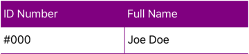
Let's see how to make the headers look different by changing a few properties:
<grial:DataGrid
    ItemsSource="{ Binding MyTabularData }"
    RowSeparatorColor="Purple"
    ColumnSeparatorColor="Purple"
>
    <grial:DataGrid.ColumnDefinitions>
        <grial:DataGridColumn
            BindingPath="Id"
            HeaderText="ID Number"
            HeaderBackgroundColor="Purple"
            HeaderTextColor="White"
        />
        <grial:DataGridColumn
            BindingPath="Name"
            HeaderText="Full Name"
            HeaderBackgroundColor="Purple"
            HeaderTextColor="White"
        />
    </grial:DataGrid.ColumnDefinitions>
</grial:DataGrid>
The result will look like the following:
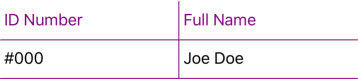
Let's see how to change the look and feel to display just borders:
<grial:DataGrid
    ItemsSource="{ Binding MyTabularData }"
    RowSeparatorColor="Purple"
    ColumnSeparatorColor="Purple"
    HeaderRowSeparatorColor="Purple"
    HeaderColumnSeparatorColor="Purple"
>
    <grial:DataGrid.ColumnDefinitions>
        <grial:DataGridColumn
            BindingPath="Id"
            HeaderText="ID Number"
            HeaderBackgroundColor="Transparent"
            HeaderTextColor="Purple"
        />
        <grial:DataGridColumn
            BindingPath="Name"
            HeaderText="Full Name"
            HeaderBackgroundColor="Transparent"
            HeaderTextColor="Purple"
        />
    </grial:DataGrid.ColumnDefinitions>
</grial:DataGrid>
The result will look like the following:
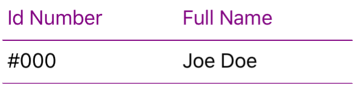
Now, let's change the default GridSeparatorVisibility value (DataGridSeparatorVisibility.All)) to just display "Horizontal" lines:
<grial:DataGrid
    ItemsSource="{ Binding MyTabularData }"
    RowSeparatorColor="Purple"
    ColumnSeparatorColor="Purple"

    GridSeparatorVisibility="Horizontal"
    HeaderSeparatorVisibility="Horizontal"
    HeaderRowSeparatorColor="Purple"

>
    <grial:DataGrid.ColumnDefinitions>
        <grial:DataGridColumn
            BindingPath="Id"
            HeaderText="Id Number"
            HeaderBackgroundColor="Transparent"
            HeaderTextColor="Purple"

        />
        <grial:DataGridColumn
            BindingPath="Name"
            HeaderText="Full Name"
            HeaderBackgroundColor="Transparent"
            HeaderTextColor="Purple"
        />
    </grial:DataGrid.ColumnDefinitions>
</grial:DataGrid>
The result will look like the following:
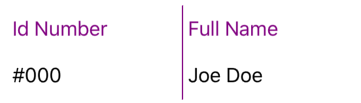
Let's see how out DataGrid looks like when we set the GridSeparatorVisibility and HeaderSeparatorVisibility to "Vertical":
<grial:DataGrid
    ItemsSource="{ Binding MyTabularData }"
    RowSeparatorColor="Purple"
    ColumnSeparatorColor="Purple"

    GridSeparatorVisibility="Vertical"
    HeaderSeparatorVisibility="Vertical"

    HeaderRowSeparatorColor="Purple"
    HeaderColumnSeparatorColor="Purple"

>
    <grial:DataGrid.ColumnDefinitions>
        <grial:DataGridColumn
            BindingPath="Id"
            HeaderText="Id Number"
            HeaderBackgroundColor="White"
            HeaderTextColor="Purple"

        />
        <grial:DataGridColumn
            BindingPath="Name"
            HeaderText="Full Name"
            HeaderBackgroundColor="White"
            HeaderTextColor="Purple"
        />
    </grial:DataGrid.ColumnDefinitions>
</grial:DataGrid>
The result will look like the following:
Things to keep in mind while working with the DataGrid
By default, when a DataGrid is rendered it will fill the available vertical space.
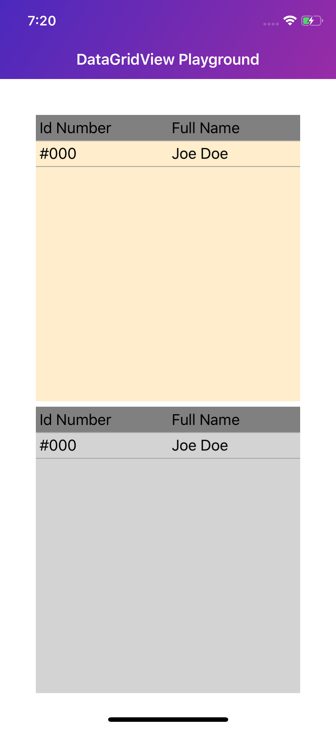
If a second DataGrid needs to be added immediately below the first one, you will need to set the RowHeight property -of the first DataGrid- to an specific value.
<StackLayout Margin="40">

    <grial:DataGrid
        ItemsSource="{ Binding MyTabularData }"
        BackgroundColor="#33ffa700"
        GridSeparatorVisibility="Horizontal"
        HeaderSeparatorVisibility="Horizontal"

        RowHeight="32"
    >
        <grial:DataGrid.ColumnDefinitions>
            <grial:DataGridColumn
                BindingPath="Id"
                HeaderText="Id Number"
            />
            <grial:DataGridColumn
                BindingPath="Name"
                HeaderText="Full Name"
            />
        </grial:DataGrid.ColumnDefinitions>
    </grial:DataGrid>

    <grial:DataGrid
        ItemsSource="{ Binding MyTabularData }"
        BackgroundColor="LightGray"

        GridSeparatorVisibility="Horizontal"
        HeaderSeparatorVisibility="Horizontal"
    >
        <grial:DataGrid.ColumnDefinitions>
            <grial:DataGridColumn
                BindingPath="Id"
                HeaderText="Id Number"
            />
            <grial:DataGridColumn
                BindingPath="Name"
                HeaderText="Full Name"
            />
        </grial:DataGrid.ColumnDefinitions>
    </grial:DataGrid>
</StackLayout>
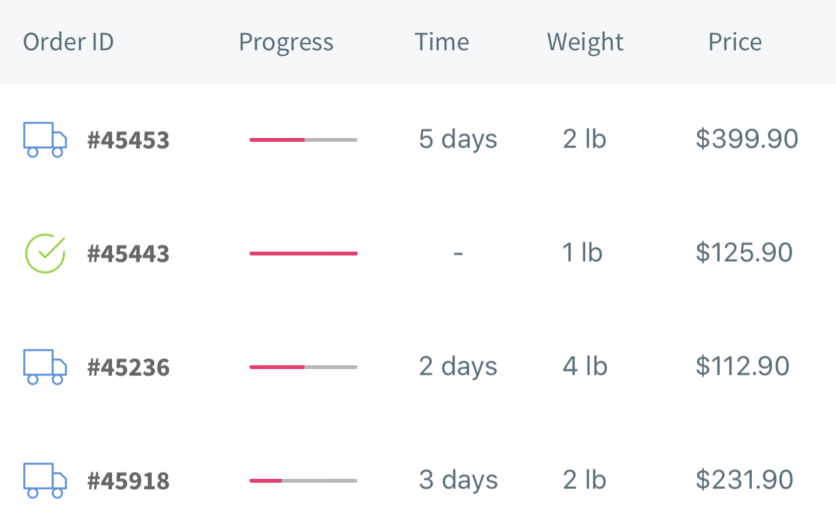
An advanced example using custom data templates for cells can be found in Grial's ShippingDetailPage.xaml.