Charts
Table of content
Overview
Grial supports different types of Charts for .NET MAUI that can represent data in a visually appealing way. You can easily customize how they look with style properties or through a theme.
As usual, Grial includes specific pages showcasing Charts to cover common data visualization scenarios. The charts are styled according to Grial themes so they play well with the rest of the UI.
SeriesChart
The SeriesChart is the base type for all the chars supporting series. The Series property of type ICollection<ChartSeries> is used to load the chart data.
They also support selection through SelectedSeriesIndex and SelectedIndex bindable properties.
Adding a legend is also possible in series charts by setting the Legend property. You can read more here.
Grial currently supports 2 types of series charts: Pie and Category.
Check also ChartBase and SeriesChart.
PieChart
Drawing a PieChart is done by providing PieSeries to the Series property, as shown in the following example.
Xaml
<!--  PIE CHART  -->
<grial:PieChart
    HeightRequest="350"
    LabelFontColor="DimGray"
    LabelFontSize="12"
    StrokeColor="White"
    StrokeSize="1">

    <grial:PieSeries
        ItemsSource="{ Binding Values }"
        ColorPath="Color"
        LabelPath="Name"
        ValuePath="Value"
        InnerRadius="0.7" />

</grial:PieChart>
ViewModel
public class ViewModel {
    public ObservableCollection<Entry> Values { get; private set; } = new ObservableCollection<Entry>()
    {
        { new Entry { Name = "Contacts", Value = 721.02, Color = Color.FromArgb("#FF5530") } },
        { new Entry { Name = "Documents", Value = 891.06, Color = Color.FromArgb("#007AFF") } },
        { new Entry { Name = "Notifications", Value = 441.81, Color = ColorsColor.FromArgb("#34C759") } },
        { new Entry { Name = "Media", Value = 333.43, Color = Color.FromArgb("#5AC8FA") } },
        { new Entry { Name = "Music", Value = 1093.73, Color = Color.FromArgb("#AF52DE") } },
        { new Entry { Name = "Purchases", Value = 387.27, Color = Color.FromArgb("#FFA72A") } }
    };
}
Result
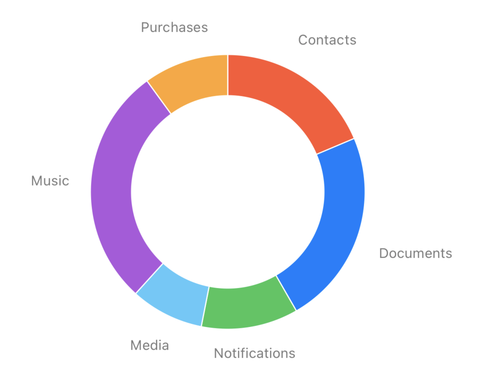
PieChart control only accepts a single series of type PieSeries. If more than one series is set an ArgumentException is thrown.
In this example PieSeries has its ItemsSource property bound to the collection of data defined in the view model. The properties from the model that represent the value, the color and the label are indicated through ValuePath, ColorPath and LabelPath properties respectively.
You can read more about Pie Charts here.
CategoryChart
The category chart supports both LineSeries and BarSeries. Line and Bars can also be mixed in a single chart.
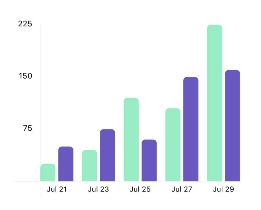
Let's check a Bar chart example:
Xaml
<!--  BAR CHART  -->
<grial:CategoryChart
    AxisLinesColor="#F1F1F2"
    HeightRequest="260"
    CategorySeparation="12"
    ItemSeparation="4">

    <grial:BarSeries
        ItemsSource="{ Binding Data }"
        LabelPath="Label"
        ValuePath="FirstValue"
        CornerRadius="5"
        ShowBackgroundBar="False"
        Color="#78F0C1" />

    <grial:BarSeries
        ItemsSource="{ Binding Data }"
        LabelPath="Label"
        ValuePath="SecondValue"
        CornerRadius="5"
        ShowBackgroundBar="False"
        Color="#6F55C6" />

</grial:CategoryChart>
In this example both series are bound to the same collection defined in the view model, we use ValuePath to indicate whether to use FirstValue or SecondValue.
ViewModel
public class ViewModel {
public ObservableCollection<Item> Data { get; private set; } = new ObservableCollection<Item>()
{
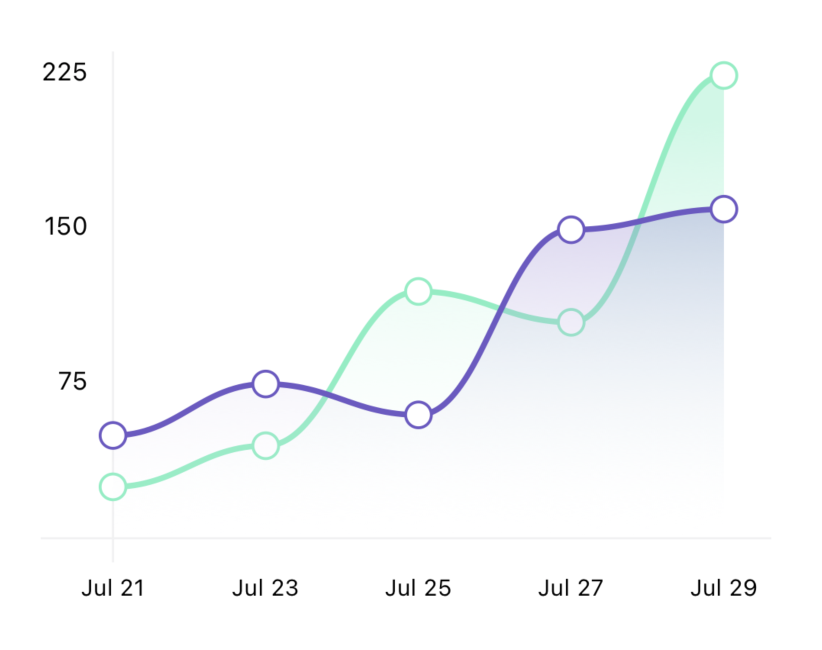
{new Item(){ FirstValue = 25, SecondValue = 50, Label = "Jul 21"} },
{new Item(){ FirstValue = 45, SecondValue = 75, Label = "Jul 23"} },
{new Item(){ FirstValue = 120, SecondValue = 60, Label = "Jul 25"} },
{new Item(){ FirstValue = 105, SecondValue = 150, Label = "Jul 27"} },
{new Item(){ FirstValue = 225, SecondValue = 160, Label = "Jul 29"} },
};
}
Result
In case you want to draw a line chart you can do it by changing the type of the series to LineSeries as shown below.
<ContentPage.Resources>
    <ResourceDictionary>
        <!--  GRADIENTS DEFINITION  -->
        <LinearGradientBrush x:Key="FirstBrush" EndPoint="0,1">
            <GradientStop Offset="0.1" Color="#6678F0C1" />
            <GradientStop Offset="1.0" Color="#00FFFFFF" />
        </LinearGradientBrush>
        <LinearGradientBrush x:Key="SecondBrush" EndPoint="0,1">
            <GradientStop Offset="0.1" Color="#666F55C6" />
            <GradientStop Offset="1.0" Color="#00FFFFFF" />
        </LinearGradientBrush>
    </ResourceDictionary>
</ContentPage.Resources>

<!--  LINE CHART  -->
<grial:CategoryChart
    AxisFontMargin="0"
    AxisLinesColor="#F1F1F2"
    HeightRequest="260">

    <grial:LineSeries
        AreaBrush="{ StaticResource FirstBrush }"
        ItemsSource="{ Binding Data }"
        LabelPath="Label"
        ValuePath="FirstValue"
        FillPoints="False"
        Color="#78F0C1" />

    <grial:LineSeries
        AreaBrush="{ StaticResource SecondBrush }"
        ItemsSource="{ Binding Data }"
        LabelPath="Label"
        ValuePath="SecondValue"
        FillPoints="False"
        Color="#6F55C6" />

</grial:CategoryChart>
Result
You can read more about Category Charts here.
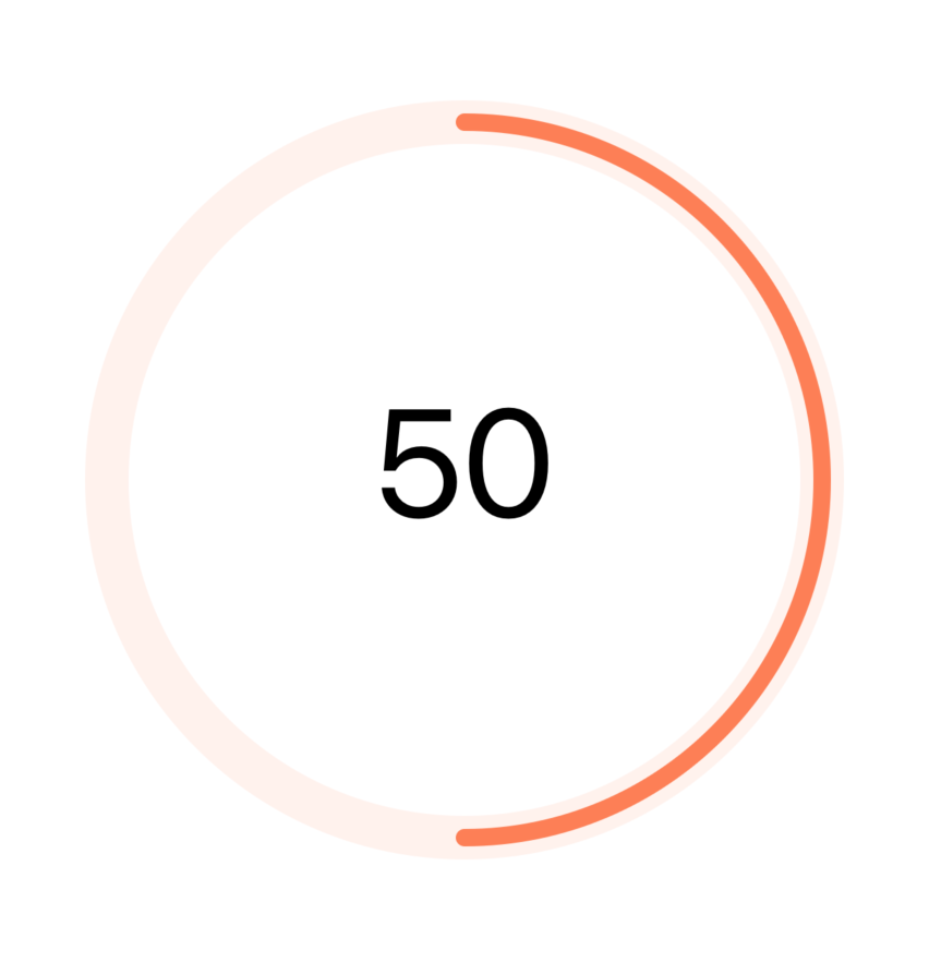
RingChart
The Ring chart is a simple chart that has a Value property. By default the Minium and Maximum properties are set to 0 and 100 respectively.
Xaml
<charts:RingChart
    BackgroundRingColor="Coral"
    BackgroundRingOpacity="0.1"
    BackgroundRingStrokeSize="20"
    HeightRequest="400"
    IsAnimated="True"
    LabelFontColor="Black"
    LabelFontSize="70"
    ValueFormat="0"
    Color="Coral"
    Value="50" />
Result
You can read more about Ring Charts here.
Theme
Sometimes the color to represent a specific data or series of data comes from the data itself, but, if that's not the case a Theme comes in handy. Themes are a set of brushes (or colors) defined as a ChartTheme instance. Charts have a Theme to hold the theme.
<!--  THEME SAMPLE -->
<grial:ChartTheme x:Key="SampleTheme">

    <LinearGradientBrush EndPoint="0,1">
        <GradientStop Offset="0.1" Color="#6678F0C1"/>
        <GradientStop Offset="1.0" Color="#00FFFFFF" />
    </LinearGradientBrush>

    <LinearGradientBrush  EndPoint="0,1">
        <GradientStop Offset="0.1" Color="#666F55C6"/>
        <GradientStop Offset="1.0" Color="#00FFFFFF" />
    </LinearGradientBrush>

    <SolidColorBrush Color="RoyalBlue" />

    <SolidColorBrush Color="LightCoral" />

    <SolidColorBrush Color="LimeGreen" />

    <SolidColorBrush Color="MediumOrchid" />

</grial:ChartTheme>
<grial:PieChart
    Theme="{ Binding Source={x:StaticResource SampleTheme} }">

</grial:PieChart>
A theme can also be set as Default using an implicit Xaml Style for the charts.
<!--  CHARTS DEFAULT THEME -->
<Style TargetType="grial:ChartBase" ApplyToDerivedTypes="true">
    <Setter Property="Theme" Value="{ StaticResource SampleTheme }" />
</grial:ChartConfiguration>
Check theme's API here.