CategoryChart
Definition
public class CategoryChart : SeriesChart<CategorySeries, MultiSeriesLegend>
Properties
| Name | Type | Description | Default |
|---|---|---|---|
| Series | ICollection<CategorySeries> | Gets or sets the series to draw | null |
| CategorySeparation | double | Gets or sets the spacing between the categories | 8d |
| ItemSeparation | double | Gets or sets the spacing between the series | 2d |
| CategoryLabels | IEnumerable<string> | Gets or sets the name of the categories | null |
| CategoryComparer | IComparer<string> | Gets or sets the comparer to order the categories when drawing | null |
| DisplayLabelsOnTop | bool | If true, chart will show labels on top of canvas | true |
| DisplayValues | bool | If true, chart will show values opposite to labels; only if there is one series | false |
| ValueLabelFontColor | Color | Gets or Sets the color of the values shown opposite to the labels; only if there is one series | Colors.Black |
| GridDashPattern | DoubleCollection | Gets or sets the pattern of the grid lines | [6, 6] |
| AxisFontSize | double | Gets or Sets the axis font size | 11d |
| AxisFontMargin | double | Gets or Sets the axis font margin | 5d |
| AxisFontColor | Color | Gets or Sets the axis font color | Colors.Black |
| AxisFontFamily | IFont | Gets or Sets the axis font family | Font.Default |
| AxisLinesColor | Color | Gets or Sets the axis lines color | Colors.LightGray |
| AxisLinesStrokeSize | double | Gets or Sets the axis lines stroke size | 0.9d |
| DisplayValuesGridLines | bool | If true values grid lines will be drawn | false |
| DisplayReferenceGridLines | bool | If true references grid lines will be drawn | false |
| DisplayValuesAxis | bool | If true reference axis will be drawn | true |
| DisplayReferenceAxis | bool | If true values axis will be drawn | true |
| MaxValue | double? | Gets or Sets the maximum value that will be drawn | null |
| MinValue | double? | Gets or Sets the minimum value that will be drawn | null |
| ReferenceValueFormatter | Func<double, string> | Gets or sets the formater for references | null |
| ReferenceCount | int | Gets or sets the amount of references that should be drown | 3 |
CategoryLabels
By default, the categories used to draw are taken from the series's ItemsSource (using the LabelPath property). This behavior is shown in this example, in which the categories are loaded from the Label property present in the Item class.
As an alternative method to set the categories of the chart, the CategoryChart has the CategoryLabels property. A string collection can be passed and will be used as categories. In case there are also LabelPath in the series they will be merged together.
The ViewModel is used to illustrate how to use the CategoryLabels property.
ViewModel
public class ViewModel {
    public ObservableCollection<Item> AppSpentWithLabels { get; private set; } = new ObservableCollection<Item>()
    {
        { new Item { FirstValue = 80, SecondValue = 30, Label = "Aug" } },
        { new Item { FirstValue = 50, SecondValue = 120, Label = "Jul" } },
        { new Item { FirstValue = 60, SecondValue = 75, Label = "Jun" } },
        { new Item { FirstValue = 100, SecondValue = 115, Label = "May" } },
        { new Item { FirstValue = 50, SecondValue = 80, Label = "Apr" } },
        { new Item { FirstValue = 90, SecondValue = 110, Label = "Mar" } },
        { new Item { FirstValue = 60, SecondValue = 110, Label = "Feb" } },
        { new Item { FirstValue = 100, SecondValue = 140, Label = "Jan" } },
    };

    public ObservableCollection<List<int>> AppSpent { get; private set; } = new ObservableCollection<List<int>>()
    {
        { new List<int> { 100, 60, 90, 50, 100, 60, 50, 80 } },
        { new List<int> { 140, 110, 110, 80, 115, 75, 120, 30 } }
    };

    public ObservableCollection<string> AppSpentLabels { get; private set; } = new ObservableCollection<string>()
    {
        "Jan", "Feb", "Mar", "Apr", "May", "Jun", "Jul", "Aug"
    };
}
This ViewModel has two collections of data that are going to be used to draw the charts. The AppSpentWithLabels collection has the values and labels. The AppSpent collection contains two lists with values only.
Xaml
<!--  APP SPENT WITH LABELS  -->
<grial:CategoryChart
    AxisLinesColor="#F1F1F2"
    CategoryLabels="{ Binding AppSpentLabels }"
    HeightRequest="300"
    ItemSeparation="10">

    <grial:LineSeries
        Title="Marketing"
        CurveFactor="0"
        IsStacked="False"
        LabelPath="Label"
        ValuePath="FirstValue"
        ItemsSource="{ Binding AppSpentWithLabels }"
        Color="#1A65C9" />

    <grial:LineSeries
        Title="Uncategorized"
        CurveFactor="0"
        IsStacked="False"
        LabelPath="Label"
        ValuePath="SecondValue"
        ItemsSource="{ Binding AppSpentWithLabels }"
        Color="#F98600" />

</grial:CategoryChart>
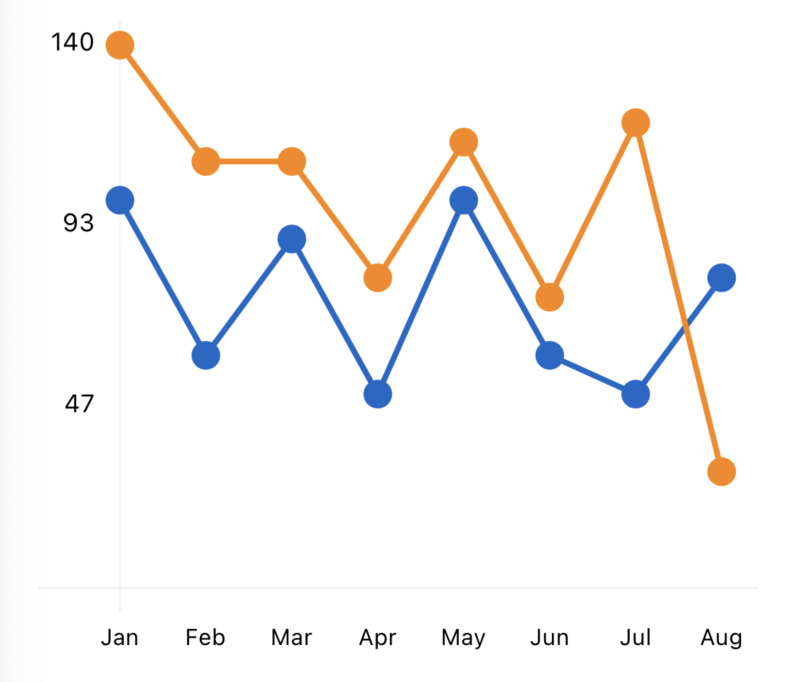
In this example the CategoryChart has the CategoryLabels property bound to the AppSpentLabels property of the ViewModel, and the ValuePath and LabelPath properties of the series set to their corresponding path to the property in the model used.
The result produced by this Xaml will be that the categories are presented honoring the order of the IEnumerable<string> passed to the CategoryLabels property, and if any new label is found in the data it will be added at the end.
Result
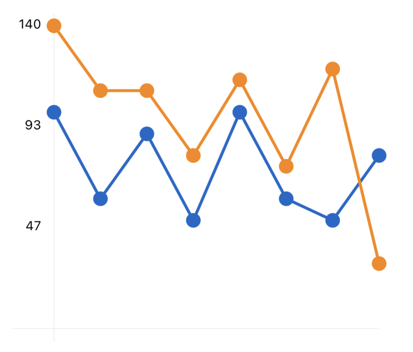
If we want to use only values, ItemsSource property can receive a collection of numbers and again, they will be presented honoring the order of CategoryLabels.
Xaml
<!--  APP SPENT  -->
<grial:CategoryChart
    AxisLinesColor="#F1F1F2"
    CategoryLabels="{ Binding AppSpentLabels }"
    DisplayReferenceAxis="True"
    HeightRequest="300"
    ItemSeparation="10">

    <grial:LineSeries
        Title="Marketing"
        CurveFactor="0"
        ItemsSource="{ Binding AppSpent[0] }"
        Color="#1A65C9" />

    <grial:LineSeries
        Title="Uncategorized"
        CurveFactor="0"
        ItemsSource="{ Binding AppSpent[1] }"
        Color="#F98600" />

</grial:CategoryChart>
This example produces the same output of the previous example. Here the ItemsSource properties are bound to de lists of integers of the ViewModel.
Important
If the
ItemsSourceproperty is bound to a collection of numbers,LabelPathandValuePathmust not be set.
Drawing without Labels
If drawing labels is not necessary, both the LabelPath and the CategoryLabels can be omitted.
<!--  APP SPENT WITHOUT LABELS  -->
<grial:CategoryChart
    AxisLinesColor="#F1F1F2"
    HeightRequest="300"
    ItemSeparation="10">

    <grial:LineSeries
        Title="Marketing"
        CurveFactor="0"
        ItemsSource="{ Binding AppSpent[0] }"
        Color="#1A65C9" />

    <grial:LineSeries
        Title="Uncategorized"
        CurveFactor="0"
        ItemsSource="{ Binding AppSpent[1] }"
        Color="#F98600" />

</grial:CategoryChart>
Result
CategorySeries
Definition
public abstract class CategorySeries : ChartSeries
Properties
| Name | Type | Description | Default |
|---|---|---|---|
| Title | string | Gets or sets the title of the series to use when drawing the legend | string.Empty |
| Color | Color | Gets or sets the color of the series | null |
| ColorOpacity | double | Sets the Alpha modifier value to use when drawing series color. Value must be within 0 and 1 | 1d |
| IsStacked | bool | Gets or sets if data will be displayed in the same column or not | false |
BarSeries
Definition
public class BarSeries : CategorySeries
Properties
| Name | Type | Description | Default |
|---|---|---|---|
| ShowBackgroundBar | bool | If true chart will draw background bars and value bars. If not only value bars will be drawn | true |
| BackgroundBarColor | Color | Gets or sets the background color to use when drawing each bar | Colors.RoyalBlue |
| BackgroundBarOpacity | double | Gets or sets the alpha of the background color to use when drawing each bar | 0.1d |
| CornerRadius | double | Gets or Sets the top left and top right corner radius of the bar | 0d |
| SelectedColor | Color | Gets or sets the color for the selected bar | Colors.Black |
LineSeries
Definition
public class LineSeries : CategorySeries
Properties
| Name | Type | Description | Default |
|---|---|---|---|
| CurveFactor | double | Sets how 'curvy' the line will be when drawn. Accepts values between 0 and 1 | 0.6d |
| AreaBrush | Brush | Gets or Sets the brush to use when drawing area of line | null |
| DisplayPoints | bool | If set to true points will be drawn | true |
| PointSize | double | Gets or Sets the radius for each point | 5d |
| SelectedPointSize | double | Gets or Sets the radius for the selected point | 8d |
| FillPoints | bool | Gets or Sets wether to fill the point or not | true |
| LineStrokeSize | double | Gets or Sets the size of the line | 2.5d |
| LineDashPattern | DoubleCollection | Gets or Sets the pattern of the line | null |
| IsExpanded | bool | Gets or Sets the line series will expand, if there are only LineSeries in the Series property of the chart | true |