Wrap Panel
Overview
The WrapPanel renders content horizontally from margin to margin.
If an item does not have enough space to be rendered, it will be moved to a new row.
It supports both direct children and bound elements through data templates.
WrapPanel Properties
| Name | Type | Description |
|---|---|---|
| ItemTemplate | DataTemplate | Template to render items from ItemsSource. |
| ItemSeparatorTemplate | DataTemplate | A template to use as separator between the elements from ItemsSource. |
| ItemsSource | IList | The source of items to display with the ItemTemplate. |
| RowSpacing | double | The space between rows. |
| ColumnSpacing | double | The space between columns. |
| Position (attached) | WrapPanelPosition | This attached property can be set on a children to indicate if it should be rendered before or after elements coming from ItemSource. Values are: WrapPanelPosition.Start and WrapPanelPosition.End. |
Samples
Let's see a simple example using a WrapPanel to render a toolbar by directly providing its content in XAML:
<grial:WrapPanel
Padding="10,0"
Margin="40"
RowSpacing="0"
BackgroundColor="#F1F1F1"
VerticalOptions="Center"
>
<grial:WrapPanel.Resources>
<ResourceDictionary>
<Style x:Key="ToolbarButtonStyle" TargetType="Button">
<Setter Property="WidthRequest" Value="40" />
<Setter Property="FontSize" Value="20" />
<Setter Property="BorderWidth" Value="0" />
<Setter Property="BackgroundColor" Value="#F1F1F1" />
<Setter Property="TextColor" Value="Black" />
<Setter Property="Text" Value="{ x:Static local:MaterialCommunityIconsFont.FormatBold }" />
<Setter Property="FontFamily" Value="{ StaticResource MaterialCommunityIcons }" />
</Style>
<Style x:Key="ToolbarSeparatorStyle" TargetType="BoxView">
<Setter Property="BackgroundColor" Value="#D3D3D3" />
<Setter Property="WidthRequest" Value="1" />
<Setter Property="HeightRequest" Value="20" />
<Setter Property="Margin" Value="6,2" />
<Setter Property="VerticalOptions" Value="Center" />
</Style>
</ResourceDictionary>
</grial:WrapPanel.Resources>
<Button
Text="{ x:Static local:MaterialCommunityIconsFont.FormatBold }"
Style="{ StaticResource ToolbarButtonStyle }"
/>
<Button
Text="{ x:Static local:MaterialCommunityIconsFont.FormatItalic }"
Style="{ StaticResource ToolbarButtonStyle }"
/>
<Button
Text="{ x:Static local:MaterialCommunityIconsFont.FormatUnderline }"
Style="{ StaticResource ToolbarButtonStyle }"
/>
<Button
Text="{ x:Static local:MaterialCommunityIconsFont.FormatColorText }"
Style="{ StaticResource ToolbarButtonStyle }"
/>
<!--SEPARATOR-->
<BoxView
Style="{ StaticResource ToolbarSeparatorStyle }"
/>
<Button
Text="{ x:Static local:MaterialCommunityIconsFont.FormatAlignLeft }"
Style="{ StaticResource ToolbarButtonStyle }"
/>
<Button
Text="{ x:Static local:MaterialCommunityIconsFont.FormatAlignCenter }"
Style="{ StaticResource ToolbarButtonStyle }"
/>
<Button
Text="{ x:Static local:MaterialCommunityIconsFont.FormatAlignRight }"
Style="{ StaticResource ToolbarButtonStyle }"
/>
<Button
Text="{ x:Static local:MaterialCommunityIconsFont.FormatAlignJustify }"
Style="{ StaticResource ToolbarButtonStyle }"
/>
<!--SEPARATOR-->
<BoxView
Style="{ StaticResource ToolbarSeparatorStyle }"
/>
<Button
Text="{ x:Static local:MaterialCommunityIconsFont.FormatIndentDecrease }"
Style="{ StaticResource ToolbarButtonStyle }"
/>
<Button
Text="{ x:Static local:MaterialCommunityIconsFont.FormatIndentIncrease }"
Style="{ StaticResource ToolbarButtonStyle }"
/>
<!--SEPARATOR-->
<BoxView
Style="{ StaticResource ToolbarSeparatorStyle }"
/>
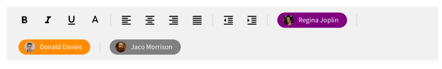
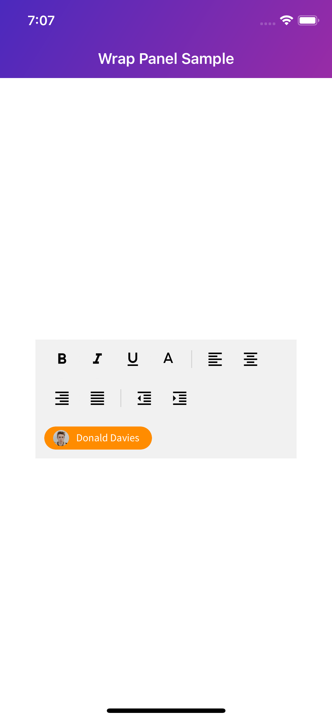
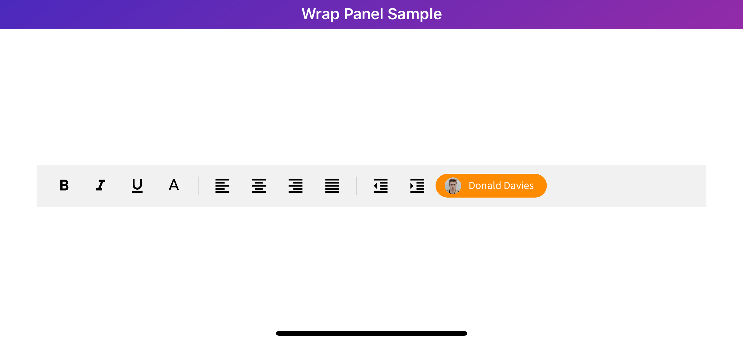
<local:Tag
Image="friend_01.png"
Text="Donald Davies" HorizontalOptions="EndAndExpand"
BackgroundColor="DarkOrange"
Margin="0,10"
/>
</grial:WrapPanel>
Let's see the result on a portrait device:
...and now in landscape:
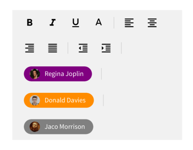
The WrapPanel also supports rendering items from data.
Let's now modify the previous sample to display not only XAML content but also data content.
We will need the following data (JSON format):
{
    "TeamMembers": [
      {

        "Name": "Regina Joplin",
        "Avatar": "friend_03.png",
        "Color": "Purple"
      },
      {

        "Name": "Donald Davies",
        "Avatar": "friend_01.png",
        "Color": "DarkOrange"
      },
      {

        "Name": "Jaco Morrison",
        "Avatar": "friend_04.png",
        "Color": "Gray"
      }
    ]
}
...and here the changes needed to be done on the above XAML:
<grial:WrapPanel
    ...
    Items="{ Binding TeamMembers }"
>
    <grial:WrapPanel.Resources>
        ...
    </grial:WrapPanel.Resources>

    ...
    <grial:WrapPanel.ItemTemplate>
        <DataTemplate>
            <local:Tag
                Image="{ Binding Avatar }"
                Text="{ Binding Name }"
                BackgroundColor="{ Binding Color }"
                Margin="10,10"
            />
        </DataTemplate>
    </grial:WrapPanel.ItemTemplate>

    <grial:WrapPanel.ItemSeparatorTemplate>
        <DataTemplate>
            <!--SEPARATOR-->
            <BoxView
                Style="{ StaticResource ToolbarSeparatorStyle }"
            />
        </DataTemplate>
    </grial:WrapPanel.ItemSeparatorTemplate>
</grial:WrapPanel>
This will be the result in landscape and portrait respectively: