Grid View
Overview
Grial provides a custom grid layout that allows the rendering of bound data through an item template, as opposed to load visual elements directly as a regular MAUI Grid. In that regards is similar to a ListView. You can control the number of columns and rows and the size of the items.
GridView Properties
| Name | Type | Description |
|---|---|---|
| ItemsSource | IEnumerable<object> | The source of items to display with the ItemTemplate. |
| ItemClickCommand | ICommand | The command to be invoked once an item from GridView is clicked. |
| ItemTemplate | DataTemplate | Template to render items from ItemsSource. |
| RowCount | int | Gets or sets the number of rows of the GridView. |
| ColumnCount | int | Gets or sets the number of columns of the GridView. |
| ItemWidth | double | Gets or sets the width of the GridView items. |
| ItemHeight | double | Gets or sets the height of the GridView items. |
| ItemHeightAuto | bool | Gets or sets if the GridView items are renderer with an automatic height. |
The GridView inherits from Grid so it also has other useful properties such as RowSpacing and ColumnSpacing to control the spacing between cells.
You need to define at least RowCount or ColumnCount to fix at least 1 direction and get elements rendered.
If you set both RowCount and ColumnCount some elements might be trimmed.
Samples
Controlling how items are rendered inside the GridView
The GridView allows to set an ItemTemplate to render items from data which gives a lot of flexibility.
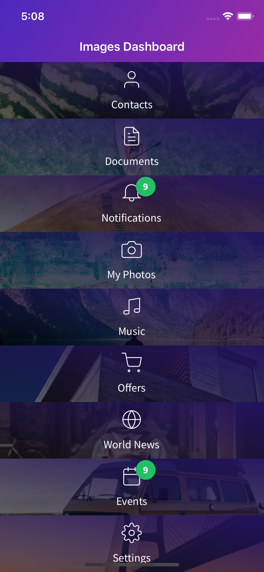
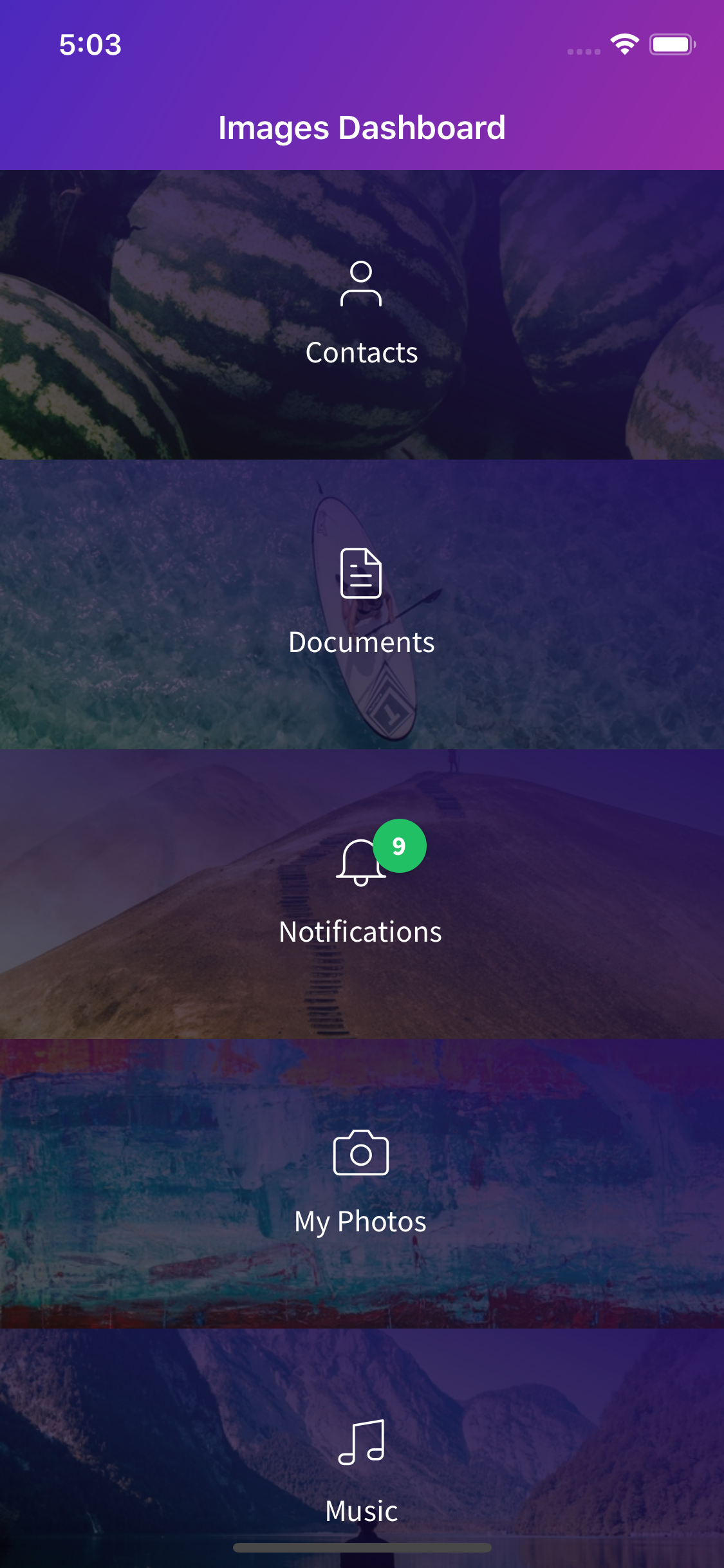
Let's check the following sample. Open ImagesDashboardPage.xaml:


The GridView used on that page has the following settings:
	<grial:GridView
		ColumnCount="3"
		ColumnSpacing="0"
		RowSpacing="0"
		Padding="0"
		VerticalOptions="FillAndExpand"
		ItemsSource="{ Binding Items }"
	>
		<grial:GridView.ItemTemplate>
			<DataTemplate>
				...
			</DataTemplate>
		</grial:GridView.ItemTemplate>
	</grial:GridView>
Let's change the GridView to render same data but in 2 columns:
	<grial:GridView
		ColumnCount="2"
		...
	>
		<grial:GridView.ItemTemplate>
			<DataTemplate>
				...
			</DataTemplate>
		</grial:GridView.ItemTemplate>
	</grial:GridView>


And now with just 1 column:
	<grial:GridView
		ColumnCount="1"
		...
	>
		<grial:GridView.ItemTemplate>
			<DataTemplate>
				...
			</DataTemplate>
		</grial:GridView.ItemTemplate>
	</grial:GridView>


Let's adjust the items height to make it look better:
	<grial:GridView
		ColumnCount="1"
		ItemHeight="150"
		...
	>
		<grial:GridView.ItemTemplate>
			<DataTemplate>
				...
			</DataTemplate>
		</grial:GridView.ItemTemplate>
	</grial:GridView>


Since the GridView inherits from Grid let's use padding and spacing properties:
	<grial:GridView
		ColumnCount="2"
		ColumnSpacing="10"
		RowSpacing="10"
		Padding="10"
		...
	>
		<grial:GridView.ItemTemplate>
			<DataTemplate>
				...
			</DataTemplate>
		</grial:GridView.ItemTemplate>
	</grial:GridView>


Using the ItemClickCommand
You can use commands to bind an event to the related ViewModel using the ItemClickCommand property of the GridView.
In order to use the ItemClickCommand property you need to:
- Create the command object in the view model and expose it as a property.
	public class MyViewModel
	{
		private readonly Command _itemCommand;

		public MyViewModel()
		{
			_itemCommand = new Command<MyItemType>(ItemAction);
		}

		public List<MyItemType> Items { ... }

		public ICommand ItemCommand => _itemCommand;

		private void ItemAction(MyItemType item)
		{
			// Action logic goes here...
		}
	}
In the example, the property is called ItemCommand.
- Bind the
ItemClickCommandto the command propertyItemCommand.
<grial:GridView
	ItemClickCommand="{ Binding ItemCommand }"
	ItemsSource="{ Binding Items }">
	<grial:GridView.ItemTemplate>
		<DataTemplate>
			...
		</DataTemplate>
	</grial:GridView.ItemTemplate>
</grial:GridView>