Drawer
The Drawer is a layout that fits specially well in full pages that need to display more information to the users in a simple and intuitive way. The quintessential use case of the drawer are maps, where it's perfect to show information related with the map at a specific position.

Getting started
The Drawer's layout has 3 parts: the Content, the ControlTemplate and the DrawerItems:
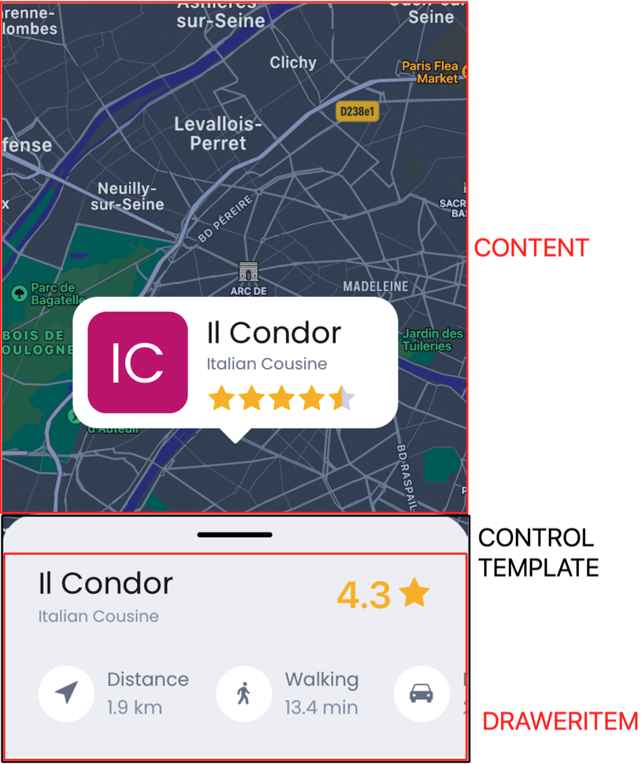
- The
Contentis the part that have the content behind the Drawer. - The
ControlTemplateis the part that acts as a 'box' and contains all theDrawerItems - Each
DrawerItemin the collection will be displayed into theControlTemplatedepending in the current position of theDrawer.
In the xaml you would have a structure like the follow one:
<grial:Drawer>
    ...
    <!-- Content displayed behind the drawer -->
    ...
    <grial:Drawer.DrawerControlTemplate>
        <ControlTemplate>
            ...
            <!-- Where the DrawerItem's content will be displayed -->
            <ContentPresenter
                Grid.Row="1"
            />
            ...
        </ControlTemplate>
    </grial:Drawer.DrawerControlTemplate>

    <grial:Drawer.DrawerItems>

        <grial:DrawerItem StopPositions="0.5*">
            ...
            <!-- Content that will be displayed into the ControlTemplate when the drawer reaches the stop positions specified -->
            ...
        </grial:DrawerItem>

        <grial:DrawerItem StopPositions="*">
            ...
            <!-- Content that will be displayed into the ControlTemplate when the drawer reaches the stop positions specified -->
            ...
        </grial:DrawerItem>
        ...
        <!-- Any amount of DrawerItems -->
        ...
    </grial:Drawer.DrawerItems>
</grial:Drawer>
Drawer Items
As you can see in the last section the DrawerItems are responsible for displaying the content in the drawer and also for defining the position at which the content will be displayed. DrawerItem has a property StopsPositions of type RowDefinitionCollection, and the drawer uses the notation to define rows with the follow semantic:
- If the value is an number, that would be the absolute stop position of the item. E.g if you set a stop position of 200, the drawer will stop at height of 200 and will display the DrawerItem's content that define the stop position of 200.
- The
star *represents the 100% of the Drawer's height, so if you put a value like0.5*that means the stop position will stay at the middle of the Drawer's Height, in the case that the max height would be the Screen Height the stop position would stay at the middle of the screen. - The
Autovalue is not supported by the Drawer.
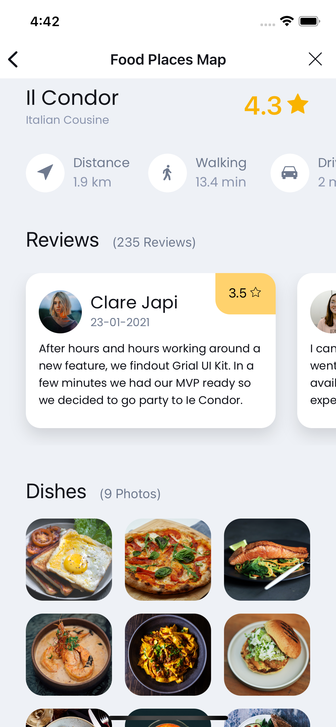
Sample
The sample included in the FoodPlacesFlow requires only one view that has two stops, one at a height of 200 to start a little bit open and a second stop at '1.05*' to be taller than the screen and hide the drawer's top.
<!--  -->
<grial:Drawer>
    ...
    <!-- The Map -->
    ...
    <grial:Drawer.DrawerControlTemplate>
        <ControlTemplate>
            ...
            <!-- The box control template -->
            ...
        </ControlTemplate>
    </grial:Drawer.DrawerControlTemplate>

    <grial:Drawer.DrawerItems>
        <grial:DrawerItem StopPositions="200, 1.05*">
            ...
            <!-- Drawer content -->
            ...
        </grial:DrawerItem>
    </grial:Drawer.DrawerItems>
</grial:Drawer>
Stop position 200


Stop position 1.05*
Caching a scroll inside the drawer
When building the DrawerItem content, you will probably need to use a ScrollView, in which case the ScrollView drag gesture conflicts with the one of the Drawer.
For that use case we provide the DrawerScrollView, that extends from the ScrollView, and knows how to handle the aforementioned conflict. Also, if you need an item collection we provide the DrawerCollectionView, that extends from the CollectionView. This control let you display a collection inside the Drawer avoiding the scrolls conflicts.
If you use more than one StopPosition in the DrawerItem you may want to ignore inner ScrollView/CollectionView scrolling until the drawer is full opened, for that reason the Drawer has a property CaptureInnerItemScrollBeforePositionIndex.
This property makes the Drawer ignore the DrawerScrollView/DrawerCollectionView inside the DrawerItems until it reaches a Position.
When you have more than one DrawerItem, and each of it has more than one StopPosition, the positions will be ordered in a unique list with all the StopPosition by size starting from the smallest StopPosition to the biggest.
Bindable Properties
| Name | Type | Description |
|---|---|---|
| CurrentPosition | double | [ReadOnly] Gets the value of the drawer's current position, the value is a percentage in reference to the full drawer size. |
| CurrentPositionIndex | double | [ReadOnly] Gets the value of the drawer's current position, the value is the index of the position in the positions array. |
| AbsoluteHeight | double | [ReadOnly] Gets the height of the drawer that is displayed at the time. |
| OpeningPercentage | double | [ReadOnly] Gets the percentage of the drawer that is displayed at the time in reference to the full drawer size. |
| EnableCrossFadeAnimation | bool | Gets or sets the value if the changes between DrawerItems have to be animated. |
| ContentSwapThreshold | float | Gets or sets how fast the swap between DrawerItems happens. |
| DrawerControlTemplate | ControlTemplate | Gets or sets the control template of the drawer. |
| ColumnDefinitions | ColumnDefinitionCollection | Gets or sets columns collection of the drawer. If there are 2 or more columns defined, the drawer will be displayed in the second one, otherwise the drawer will be displayed in the first column. This property gives flexibility to build more complex layouts, like adding horizontal separation to the edges of the screen. |
| DrawerItems | List<DrawerItem> | Gets or sets the list of DrawerItems. |
| CaptureInnerItemScrollBeforePositionIndex | int | Gets or sets the first item index where scrolling of inner DrawerScrollView and DrawerCollectionView is enabled, before that position they are disabled enabling swiping the Drawer freely. |
| ControlTemplateHeightHint | double | Gets or sets the height of the control template that the drawer will hide when it reaches the last DrawerItem and its last position. |
| ColumnDefinitions | ColumnDefinitionCollection | Gets or sets the columns around the Drawer, if there are more than one column the Drawer will be located in the column two. This property lets you define new layouts for the Drawer, e.g. align the drawer to the left or to the right. By default the value is * |
Events
| Name | Type | Description |
|---|---|---|
| PositionChanged | EventHandler | Fired when the drawer changes the current position. |
DrawerItem Properties
| Name | Type | Description |
|---|---|---|
| StopPositions | RowDefinitionCollection | Gets or sets the value of stop positions. |