Tab Control
Overview
Grial provides a custom TabControl with a fully customizable appearance through XAML templates and styles.
It allows switching views inside pages easily.

This control supports two modes:
- Direct-mode, where
TabItemsinstances are defined directly in the Xaml or added from code - Bound-mode, where
TabItemscome from data defined in theItemsSourceproperty; in this caseTabItemDataTemplateandTabContentDataTemplateare used to render the items and the content respectively
TabControl Properties
| Name | Type | Description |
|---|---|---|
| AnimateTransition | bool | Gets or set if the switch between tabs is animated or not. |
| ItemsSource | IEnumerable | Gets or sets the source of items to template and display when in bound-mode. |
| SelectedIndex | int | Gets or sets the currently selected TabItem index. |
| SelectedItem | object | Gets or sets the currently selected TabItem when in direct-mode or the currently selected object from ItemsSource when in bound-mode. |
| TabContentBackgroundColor | Color | Gets or set the Color for all the tab contents. |
| TabContentDataTemplate | DataTemplate | Template to be used by the tabs' content when in bound-mode. |
| TabContentHeight | double | Gets or set the height for the tab contents. |
| TabItemControlTemplate | ControlTemplate | Control template to be used by the tabs items when in direct-mode. |
| TabItemDataTemplate | DataTemplate | Template to be used by the tab items when in bound-mode. |
| TabItemStyle | Style | Gets or set the Style applied to the TabItem, used when in direct-mode. |
| Tabs | IList<TabItem> | Gets the collection of TabItem instances when in direct-mode. |
| TabStripBackgroundColor | Color | Gets or set the Color for the tab item strip. |
| TabStripHeight | double | Gets or set the HeightRequest for the tab item strip. |
| TabStripPlacement | TabStripPlacement | This property sets or get where the TabStrip is placed. Available values are: TopBottom |
| TabStripStyle | Style | Gets or set the Style applied to the tab item strip container that is a Grid. |
| TabsWidth | GridLength | Gets or set the Width for the TabItems. |
TabControl Events and Commands
| Name | Type | Description |
|---|---|---|
| TabTapped | Event | Fired when a TabItem was tapped. This is the first event triggered. Args: TabTappedEventArgs \{ Tab: object \} |
| SelectedTabChanging | Event | Fired when the selected TabItem is about to change. This is the second event triggered. Args: SelectedTabChangingEventArgs \{ CancelSelection: bool; NewSelection: object \}If you set CancelSelection to true the selection change is cancelled which is useful for validation scenarios where the selected tab should not change until an error is fixed. |
| TabSelected | Event | Fired when a TabItem was selected. This is the last event triggered.Args: TabSelectedEventArgs \{ Selected: object \} |
| TabTapCommand | ICommand | Executed when a TabItem is tapped, tapped item goes as the command parameter. |
| TabSelectedCommand | ICommand | Executed when a TabItem is selected, selected item goes as the command parameter. |
TabItem Properties
| Name | Type | Description |
|---|---|---|
| BadgeBackgroundColor | Color | Gets or sets the Badge background color. |
| BadgeText | string | Gets or sets the Badge text. |
| BadgeTextColor | Color | Gets or sets the Badge text color. |
| Content | View | Gets or sets the Content of the tab. |
| CurrentIconImage | ImageSource | **(readonly)**Convenient property that contains the calculated icon image, depending if the tab is selected or not. See IconImage and IconImageSelected. |
| CurrentIconText | string | **(readonly)**Convenient property that contains the calculated icon text, depending if the tab is selected or not. See IconText and IconTextSelected. |
| CurrentIconTextColor | Color | **(readonly)**Convenient property that contains the calculated icon text color, depending if the tab is selected or not. See IconTextColor and IconTextColorSelected. |
| CurrentTextColor | Color | **(readonly)**Convenient property that contains the calculated text color, depending if the tab is selected or not. See TextColor and TextColorSelected. |
| FontSize | double | Gets or sets the size of the font. |
| Header | View | Gets or sets an optional visual element to render inside the tab. |
| IconImage | ImageSource | Gets or sets the image used as icon. |
| IconImageSelected | ImageSource | Gets or sets the image used as icon for the selected tab. |
| IconText | string | Gets or sets the specific icon based on fonts, font icon family set in IconTextFontFamily. |
| IconTextColor | Color | Gets or sets the icon color for icons based on fonts. |
| IconTextColorSelected | Color | Gets or sets the icon color for icons based on fonts for the selected tab. |
| IconTextFontFamily | string | Gets or sets the font family used to render icons based on fonts. |
| IconTextFontSize | double | Gets or sets the rendered size for icons based in fonts. |
| IconTextSelected | string | Gets or sets the specific icon based on a font for the selected tab. |
| IsSelected | bool | (readonly) true if this tab is selected and false otherwise. |
| Text | string | Gets or sets the text of the tab. |
| TextColor | Color | Gets or sets the color of the tab's text. |
| TextColorSelected | Color | Gets or sets the color of the tab's text for the selected tab. |
TabItem Events and Commands
| Name | Type | Description |
|---|---|---|
| Tapped | Event | Fired when the user taps the TabItem. |
| TapCommand | ICommand | Executed when a TabItem is tapped. |
Look and Feel
Grial provide six different look and feel for tabs. They can be found here:
Grial |_ Styles |_ TabControl |_ AndroidTabResources.xaml |_ CustomTabResources.xaml |_ DotTabResources.xaml |_ IOSTabResources.xaml |_ SegmentedTabResources.xaml |_ SimpleTabResources.xaml
Each resource dictionary file is self-contained (except for the values taken from Grial themes) so you can tweak them easily. Each contain a a named TabControl style that relies on a specific template for the TabItem that look quite different from the others. Also, they are flexible since they can handle all the variations exposed in the TabItem: badges, image or text icons, texts and colors.
To use any of these only two things are required:
- include a reference to the specific resource dictionary in the page
<ContentPage.Resources>
    <ResourceDictionary Source="/Styles/TabControl/AndroidTabResources.xaml" />
</ContentPage.Resources>
- use the named style in the tab instances
<grial:TabControl Style="{ StaticResource AndroidTabStyle }"> ...
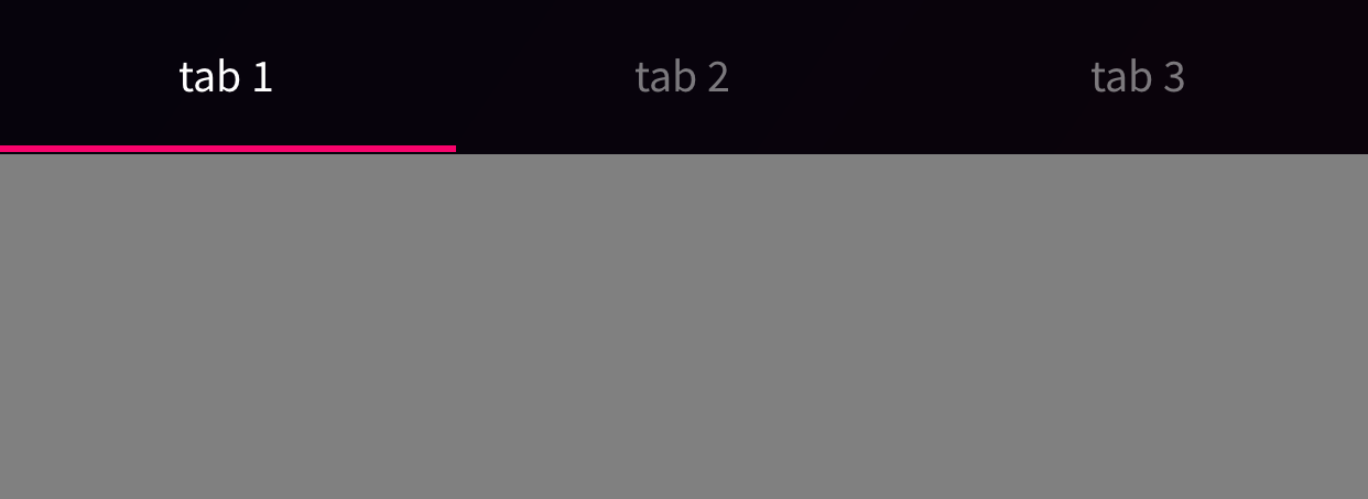
Direct-mode
The most common scenario is just using one of the six predefine styles and define the TabItems in Xaml like this:
<grial:TabControl Style="{ StaticResource AndroidTabStyle }">
    <grial:TabItem Text="tab 1">
        <Grid BackgroundColor="Gray">

        </Grid>
    </grial:TabItem>

    <grial:TabItem Text="tab 2">
        <Grid BackgroundColor="Green">

        </Grid>
    </grial:TabItem>

    <grial:TabItem Text="tab 3">
        <Grid BackgroundColor="Yellow">

        </Grid>
    </grial:TabItem>
</grial:TabControl>
Bound-mode
There are scenarios where the number of tab items and its content need to depend in some data obtained dynamically. For these scenarios the TabControl provides 3 properties:
ItemsSource, source of dataTabItemDataTemplate, item template (not to be confused withTabItemControlTemplatewhich is aControlTemplateto style the tab when in direct-mode)TabContentDataTemplate, content template
Assuming that "TabsData" is a list of objects with a "Value" property, this is the most basic example of a bound-mode tab control:
<ContentPage ...>
    <ContentPage.Resources>
        <ResourceDictionary Source="/Styles/TabControl/AndroidTabResources.xaml" />

        <DataTemplate x:Key="TabTemplate">
            <Label Text="{ Binding Value, StringFormat='Tab {0}' }" />
        </DataTemplate>

        <DataTemplate x:Key="TabContentTemplate">
            <Label Text="{ Binding Value, StringFormat='Tab {0} Content' }" />
        </DataTemplate>
    </ContentPage.Resources>

    <grial:TabControl
        Style="{ StaticResource AndroidTabStyle }"
        TabItemDataTemplate="{ StaticResource TabTemplate }"
        TabContentDataTemplate="{ StaticResource TabContentTemplate }"
        ItemsSource="{ Binding TabsData }"
    />

    ...