GrialNavigationPage


Overview
Grial UI Kit includes various helpers designed to simplify customizing the navigation bar in MAUI applications. These helpers enable seamless switching between a transparent bar and a solid one. Additionally, they provide properties to modify the navigation bar's background color, text color, and bottom shadow.
The GrialNavigationPage helpers are not compatible with MAUI's Shell. They work exclusively with NavigationPages.
Set up
To configure the helpers, you need to override the NavigationPage handler in the MauiProgram.cs file with Grial's GrialNavigationPageHandler.
public static MauiApp CreateMauiApp()
{
    var builder = MauiApp.CreateBuilder();
    builder
        .UseMauiApp<App>()
        //...
        .UseGrial()
        //...
        .ConfigureMauiHandlers(handlers =>
        {
            //...
            handlers.AddHandler<NavigationPage, UXDivers.Grial.GrialNavigationPageHandler>();
            //...
        });

    //...

    return builder.Build();
}
New setup for Android (from version 4.3.120)
We have enhanced our handler for Android to improve speed and stability. To set it up, include the file navigationlayout.axml in the path Platforms/Android/Resources/Layout/navigationlayout.axml. You can get this file downloading a new solution from the Grial Web Admin or you can create it yourself with the following content:
<?xml version="1.0" encoding="utf-8"?>
<androidx.coordinatorlayout.widget.CoordinatorLayout
        xmlns:android="http://schemas.android.com/apk/res/android"
        xmlns:app="http://schemas.android.com/apk/res-auto"
        android:id="@+id/navigation_layout"
        android:layout_width="match_parent"
        android:layout_height="match_parent">

    <FrameLayout
            android:id="@+id/navigationlayout_appbar"
            android:layout_width="match_parent"
            android:layout_height="wrap_content"
            android:elevation="4dp"
            android:background="@android:color/transparent"
            android:fitsSystemWindows="false">

        <androidx.fragment.app.FragmentContainerView
                android:id="@+id/navigationlayout_toptabs"
                android:layout_width="match_parent"
                android:layout_height="wrap_content" />
    </FrameLayout>

    <androidx.fragment.app.FragmentContainerView
            android:id="@+id/navigationlayout_content"
            android:layout_width="match_parent"
            android:layout_height="match_parent"
            app:layout_behavior="@string/appbar_scrolling_view_behavior" />

    <androidx.fragment.app.FragmentContainerView
            android:id="@+id/navigationlayout_bottomtabs"
            android:layout_width="match_parent"
            android:layout_height="wrap_content"
            android:layout_gravity="bottom" />

</androidx.coordinatorlayout.widget.CoordinatorLayout>
It is crucial that the file name and path match the specified format exactly.
Features
Let's explore the properties provided by GrialNavigationPage and how to utilize them effectively.
Bar Type
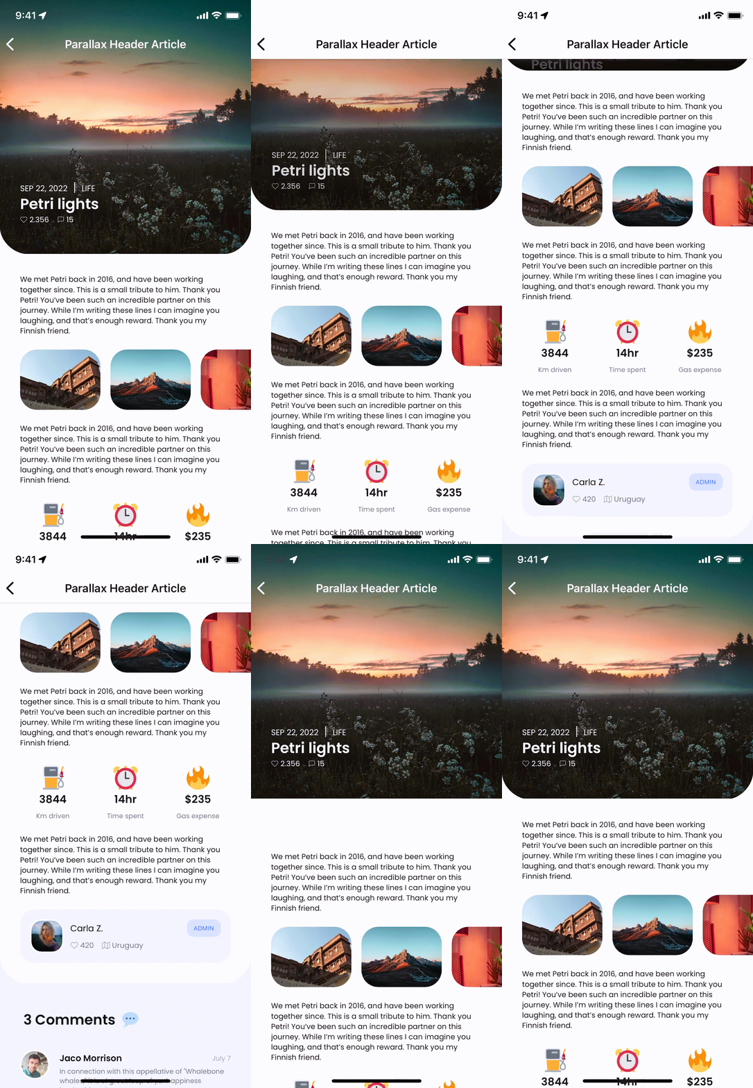
You can toggle the navigation bar between solid and transparent using the GrialNavigationPage.BarType property.
- When set to
Solid, the content appears below the navigation bar, which always maintains a solid color. - When set to
Transparent, the content is displayed behind the navigation bar. If the bar'sBackgroundColoris transparent, the content remains visible through it. Otherwise, the navigation bar covers the content with its solid color.
This property enables behaviors like the parallax effect seen in the article header example.
The precedence for the GrialNavigationPage.BarType property flows from NavigationPage to ContentPage. For example, if a ContentPage sets the property to Solid, the navigation bar will be solid even if it was set to Transparent on the NavigationPage. To ensure a ContentPage inherits the value from its parent NavigationPage, use the Unset value.
Hide Shadow and Force Shadow
- The
GrialNavigationPage.HideShadowproperty applies toNavigationPageinstances and allows you to hide the bottom shadow of the navigation bar. - The
GrialNavigationPage.ForceShadowproperty, applicable to bothContentPagesandNavigationPages, enables the addition of a bottom shadow to the navigation bar.
A typical use case is setting HideShadow to true for the NavigationPage while applying ForceShadow selectively on individual ContentPages.
Bar Text Color and Bar Background Color
- Use
GrialNavigationPage.BarBackgroundColorto set the navigation bar's background color. - Use
GrialNavigationPage.BarTextColorto modify the text color of the navigation bar.
These properties can be applied to both NavigationPage and ContentPage. Similar to the BarType property, the value set on a ContentPage takes precedence over the value set on its parent NavigationPage.