App Look and Feel
The Design tab is dedicated to all the design related tasks you can do for your app.
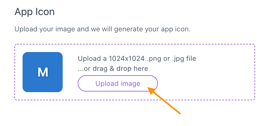
Upload your app icon
You can set the icon of your application by providing a png/jpg image of 1024x1024 pixels preferably.
That image will be resized and duplicated to generate all the icons files needed for app icon.
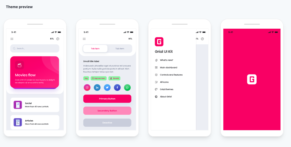
Once the source image is uploaded and all the different icon sizes are generated you will see a preview of your icon:
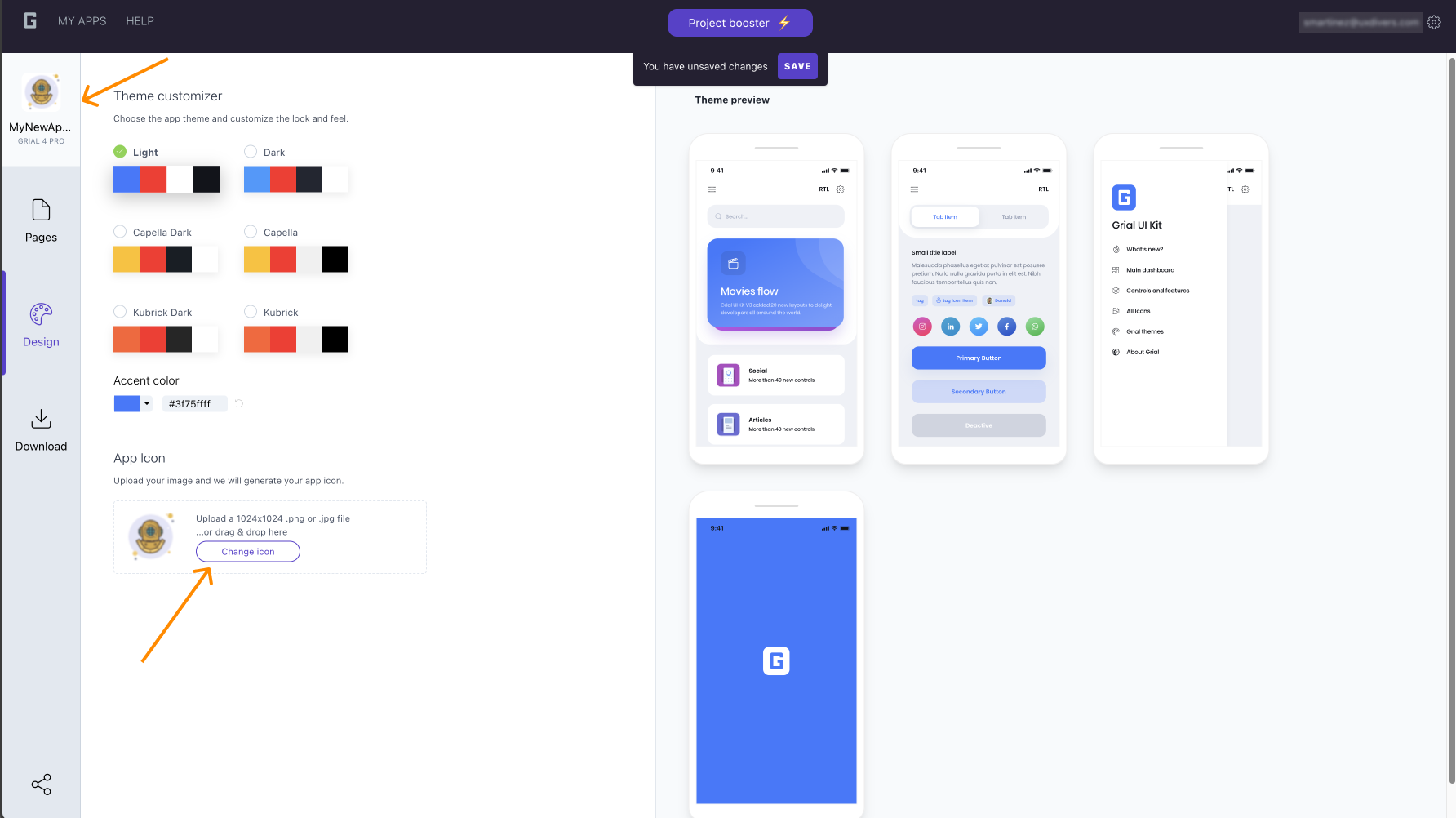
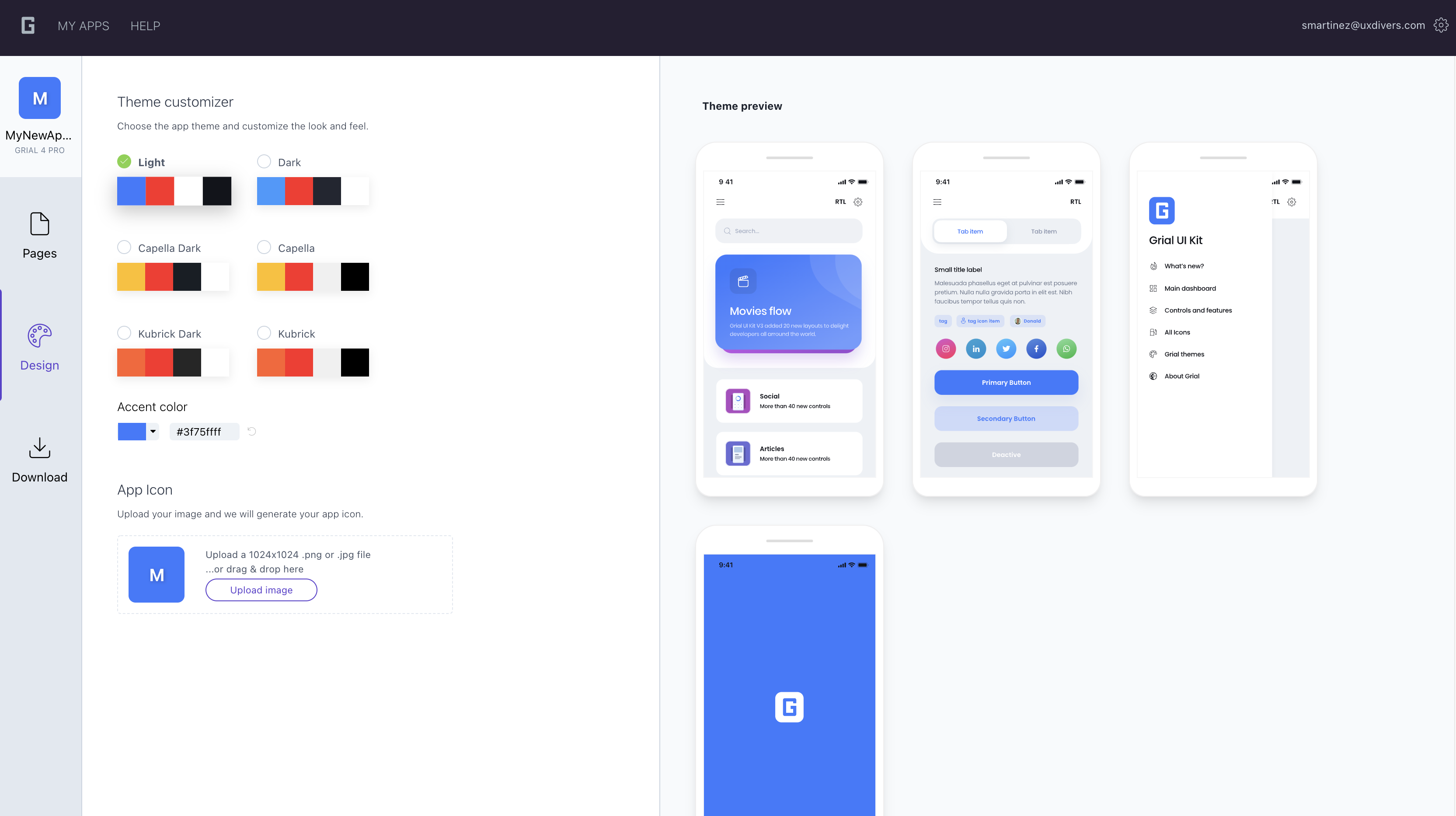
Customize the look and feel of your app
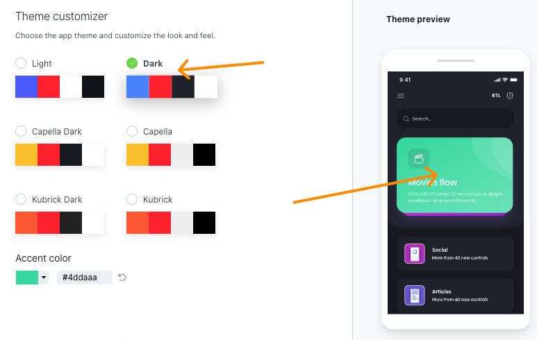
Finally, you can pick a theme for your app.
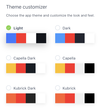
You can choose among any of the pre-built ones, and you can also generate your own by
overriding a Grial theme AccentColor.
In Grial, the most important color is the AccentColor, followed by the ComplementColor.
If you change AccentColor (overriding it) your theme will be based on this new AccentColor
color and you will get an uniform output based on it.
This is made by design to allow easily applying brand colors to your app.
Alternatively, you can tweak specific colors directly on XAML to get further customization of your theme.
Overriding a Grial theme
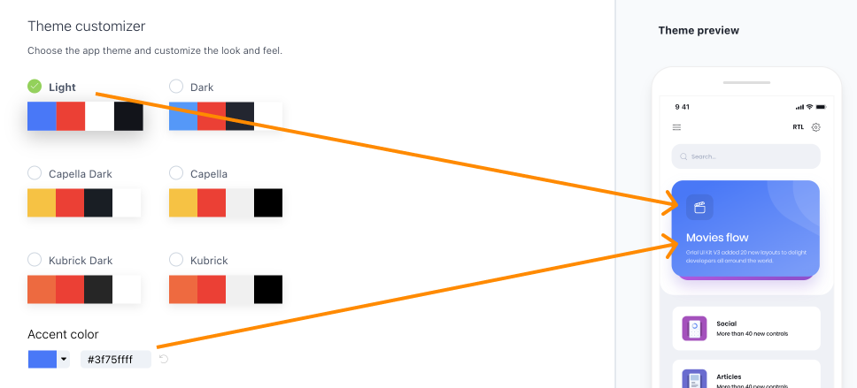
Start by choosing any of the available Grial themes (Light Theme is selected by default).
Select the theme that you want the new theme to be based on.
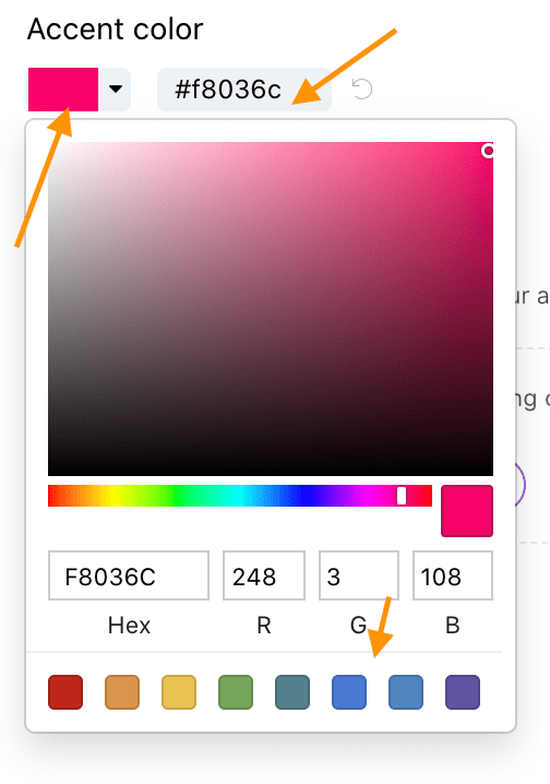
Once you get the base theme, you can overwrite the AccentColor by choosing a color or simply pasting the hex value in the text field. You can also discard this color -by clicking in the icon on the right- to get the initial AccentColor for the base theme.
You will see a preview of the selected theme on the right.
It will update every time you change/override the AccentColor
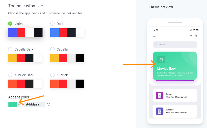
You can also change the original Grial theme -keeping the overriden AccentColor- at any time to get better results (i.e.: light vs dark background).