Card View
Overview
One of the most used mobile UI patterns now simplified in its usage and available for Xamarin.Forms through XAML. Define the shadow color, shadow size, and corner radius, set the background color and use it as a container for any element.
The CardView behaves as a Xamarin.Forms' Grid. It can have multiple children and has
RowDefinitions, ColumnDefinitions, ColumnSpacing and RowSpacing properties.
Properties
| Name | Type | Description |
|---|---|---|
| BackgroundColor | Color | Background color |
| ColumnDefinitions | ColumnDefinitionCollection | The collection of ColumnDefinition objects that control the layout of columns |
| CornerRadius | double | The radius applied to each corner |
| ColumnSpacing | double | The space between columns |
| HasShadow | bool | A boolean value that turns on/off the shadow |
| RowDefinitions | RowDefinitionCollection | The collection of RowDefinition objects that control the heights of each row |
| RowSpacing | double | The space between rows |
| ShadowSize | float | The size of the shadow |
| ShadowOpacity | float | The opacity of the shadow |
Samples
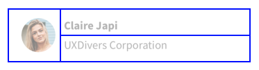
Let's see a sample code using the CardView and its layout properties:
<grial:CardView
    CornerRadius="6"
    RowSpacing="6"
    ColumnSpacing="6"
    Padding="12"
>
    <grial:CardView.RowDefinitions>
        <RowDefinition Height="*" />
        <RowDefinition Height="*" />
    </grial:CardView.RowDefinitions>

    <grial:CardView.ColumnDefinitions>
        <ColumnDefinition Width="Auto" />
        <ColumnDefinition Width="*" />
    </grial:CardView.ColumnDefinitions>

    <!-- Avatar -->
    <local:CircleCachedImage
        Grid.Column="0"
        Grid.Row="0"
        Grid.RowSpan="2"
        Source="friend_06.png"
        Style="{ StaticResource Avatar }"
        VerticalOptions="Center"
    />

    <Label
        Grid.Column="1"
        Grid.Row="0"
        Text="Claire Japi"
        Style="{ StaticResource LabelBoldStyle }"
        VerticalOptions="EndAndExpand"
    />

    <Label
        Grid.Column="1"
        Grid.Row="1"
        Text="UXDivers Corporation"
    />
</grial:CardView>
The result looks like the following picture:

As you can see from the above code, the inner Grid used to give layout to this CardView is something like this:
The layout is divided into a 4x4 Grid, but through the Grid.RowSpan="2" we made the rounded picture to occupy two rows from the grid.
Then, the remaining Label elements where positioned into row 0 and 1 respectively through the Grid.Row property.
Let's change the above code sample to make the corners look more rounded through this code CornerRadius="18":

Let's now modify the above CardView code to change the shadow properties and BackgroundColor:
<grial:CardView
    CornerRadius="18"
    RowSpacing="6"
    ColumnSpacing="6"
    Padding="12"
    ShadowSize="20"
    ShadowOpacity="1"
    BackgroundColor="LightCyan"
>
...
</grial:CardView>
The result would be something like the following picture: